
Multidisciplinary Graphic Designer, Marketing, Communications Specialist and Visual Artist who is Original, creative, and innovative in ideas with 9+ years of experience producing print, digital, web, and social media content across nonprofit, media, and higher education sectors. Brings a unique blend of creative, analytical, and people-focused expertise, combining extensive experience in visual communication, marketing strategy, and team leadership with a strong foundation in Human Resources, organizational communication, and user experience design. Proven ability to manage multiple concurrent projects within established brand environments, translate complex communication needs into compelling visual solutions, and collaborate across cross-functional teams to meet tight deadlines with precision. I am Skilled in Adobe Creative Suite (InDesign, Photoshop, Illustrator), WordPress CMS, HTML/CSS and Cascade.
Adept at working with diverse stakeholders, including faculty, students, alumni, and institutional partners, to deliver original, audience-centered, and brand-aligned design solutions that enhance engagement and organizational impact.
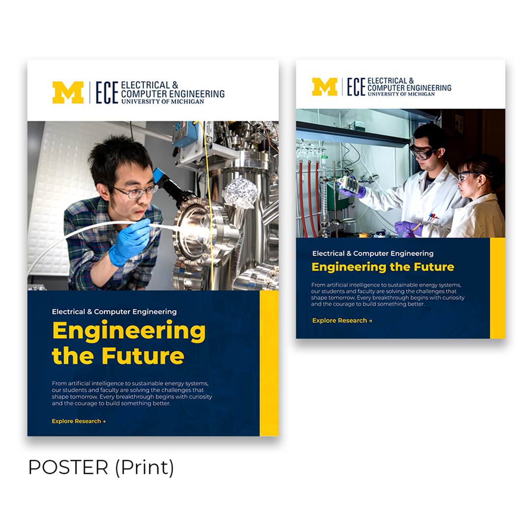
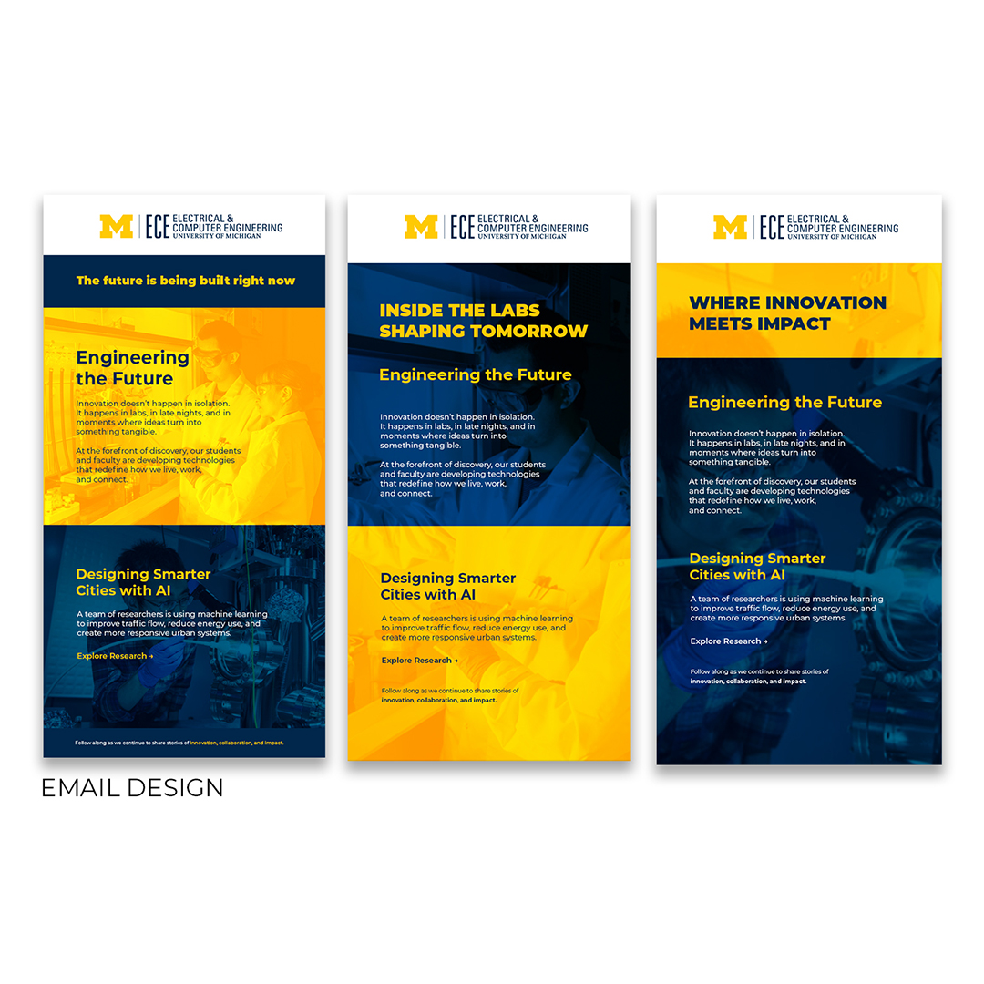
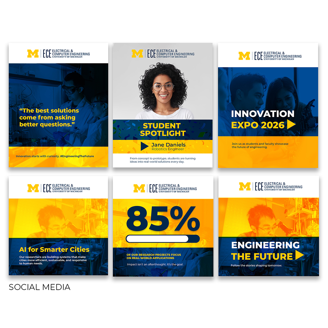
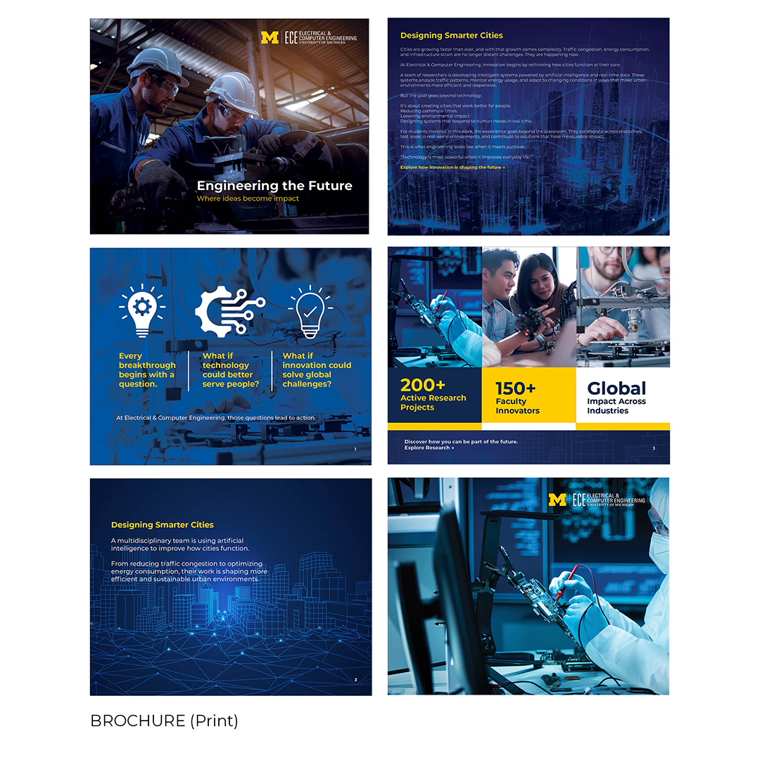
ECE Brand Campaign
"The details are not the details. The details are the design."
Client: University of Michigan — ECE
Format: Multi-Platform Campaign System
Scope: Brand Design · Editorial Layout · Email Design · Social Media · Print Production
Project: A complete visual communication system built for the University of Michigan's Electrical & Computer Engineering department — designed to carry one powerful campaign idea across four distinct platforms without losing its authority, energy, or identity.
Deliverables: Print Brochure · Email Design · Poster Series · Social Media Suite
The Idea
"Engineering the Future — Where ideas become impact."
Every format. Every platform. One voice.
The Work
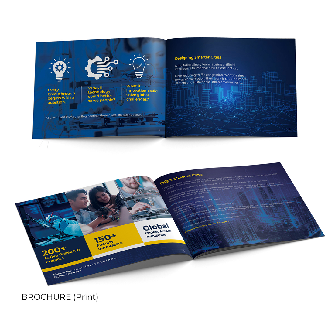
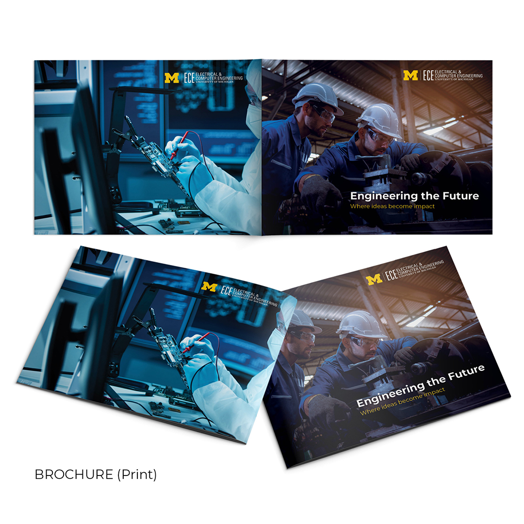
Brochure (Print): A premium landscape-format publication designed to be kept, not discarded. Bold photography, a structured navy and gold layout system, and data-forward spreads that put real researchers — and real numbers — at the centre of the story.
Email Design: Three layout variations built for the same campaign — dark, mid-tone, and premium navy — each adjusting tone while preserving complete visual identity. A/B-test ready from day one.
Poster (Print): Two portrait-format posters distilling the campaign to its absolute essence. One solo researcher. One collaborative pair. Same system. Maximum impact at large-format scale.
Social Media Suite: Six posts covering quote cards, student spotlights, event promotion, research stories, data infographics, and campaign brand content — each built to stop the scroll while staying unmistakably on-brand.
The Result: A unified design system — anchored in Michigan Navy and Gold — that delivers the same feeling whether held in your hands or glimpsed in a feed: This institution is doing something that matters. And you could be part of it.
What I deliver:
Multi-page landscape print brochure with full interior spread system,
Three email design layout variations (A/B/C testing ready),
Two-poster print series (portrait format),
Six-post social media suite (Instagram / Facebook ready),
Unified cross-platform design system with colour, typography & photography guidelines,
Print-ready and digital-optimised file formats.
360 Branding
"Your brand is more than a logo. It's every surface your customer touches."
I specialise in building brands that breathe — from the first impression to the lasting memory. My 360 Branding approach ensures that whether a customer sees your brand on a billboard, a delivery van, a hang tag, or a social media post, the story stays consistent, compelling, and unmistakably yours.
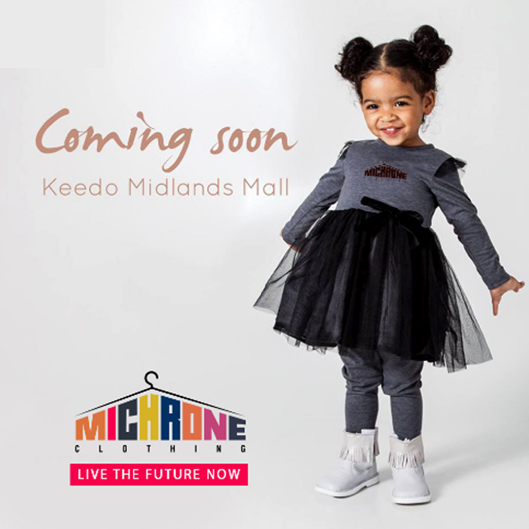
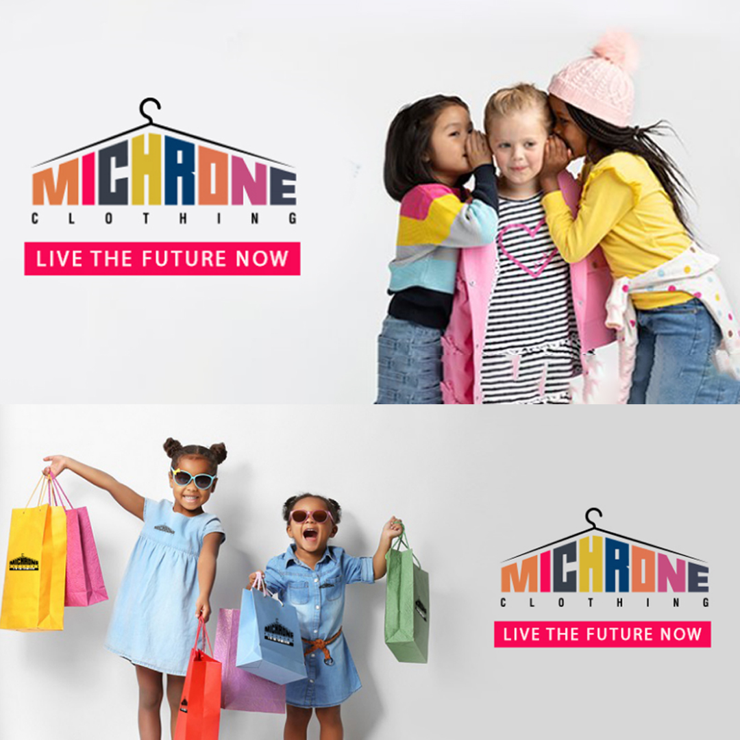
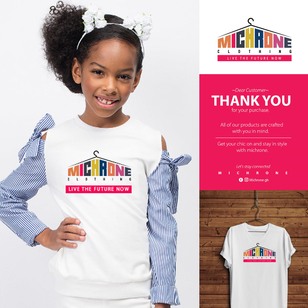
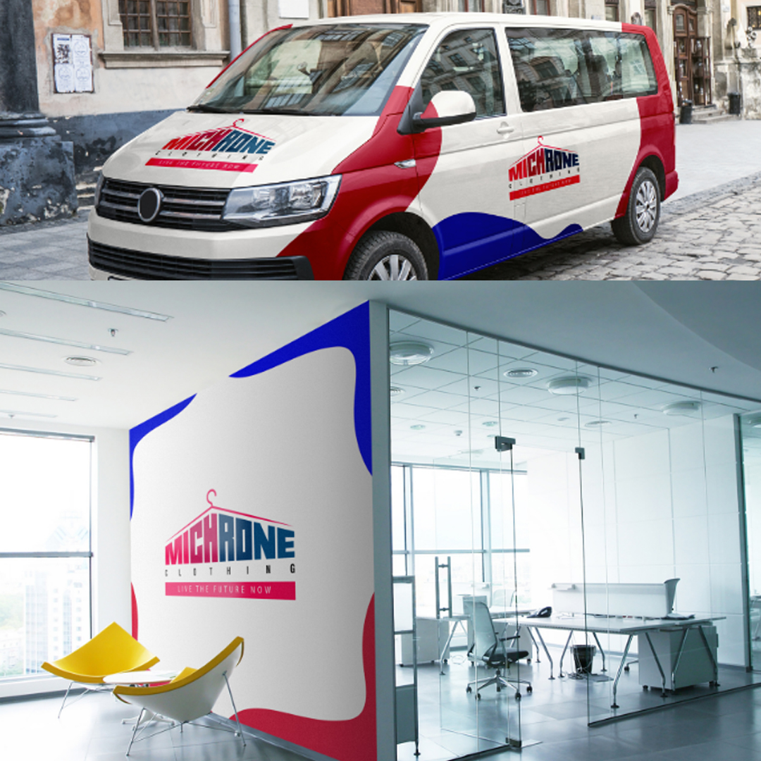
For Michrone Clothing, I developed a full brand ecosystem — social media creatives, in-store visuals, branded apparel, vehicle wraps, and customer thank-you cards — all unified under one bold, colorful identity that spoke directly to their youthful, fashion-forward audience.
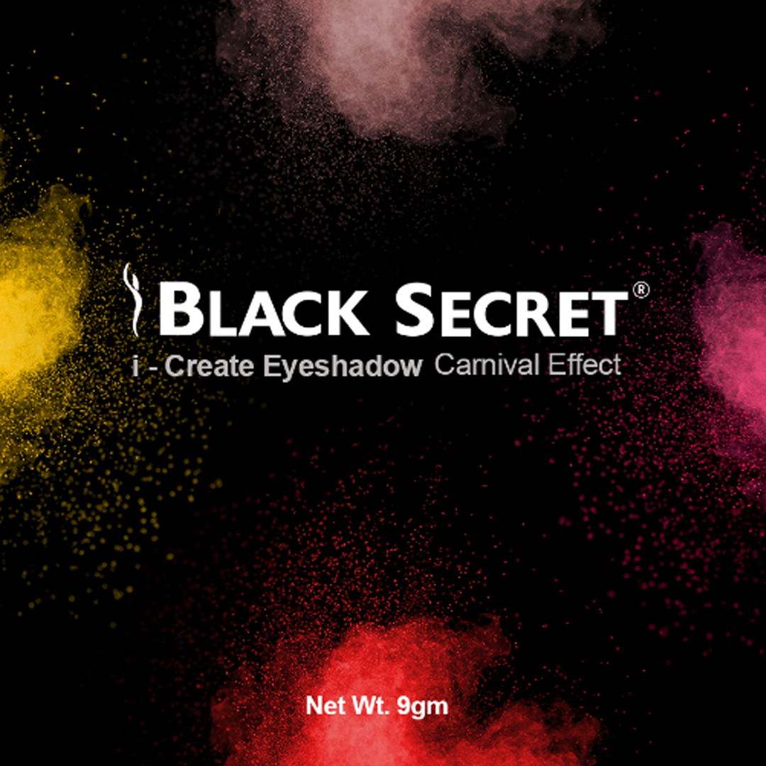
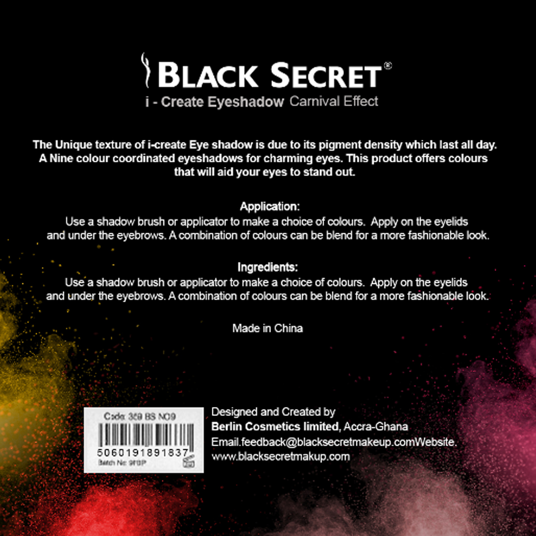
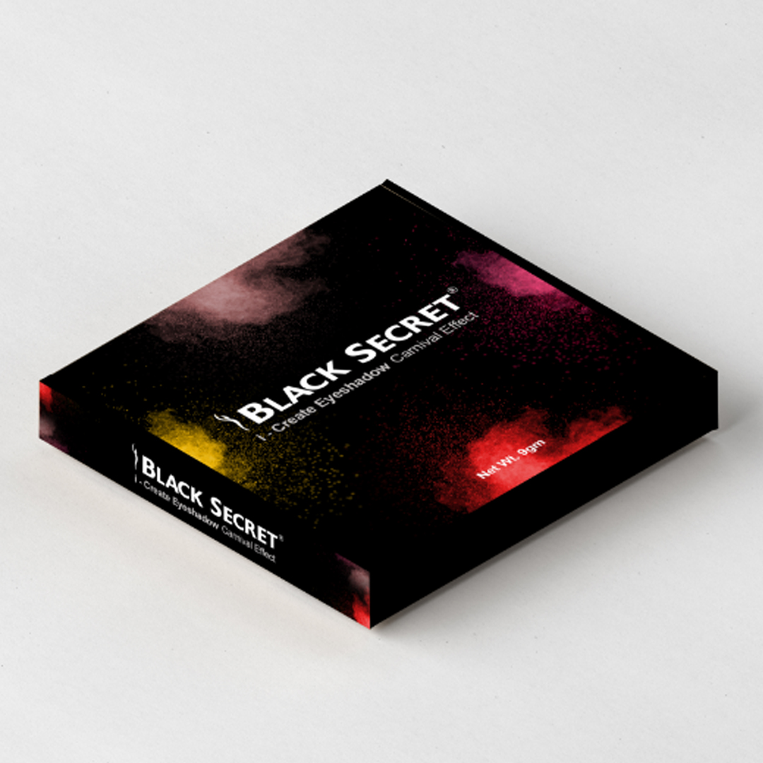
For Black Secret Cosmetics, I crafted premium product packaging that communicated luxury and confidence — turning a simple eyeshadow box into a shelf statement.
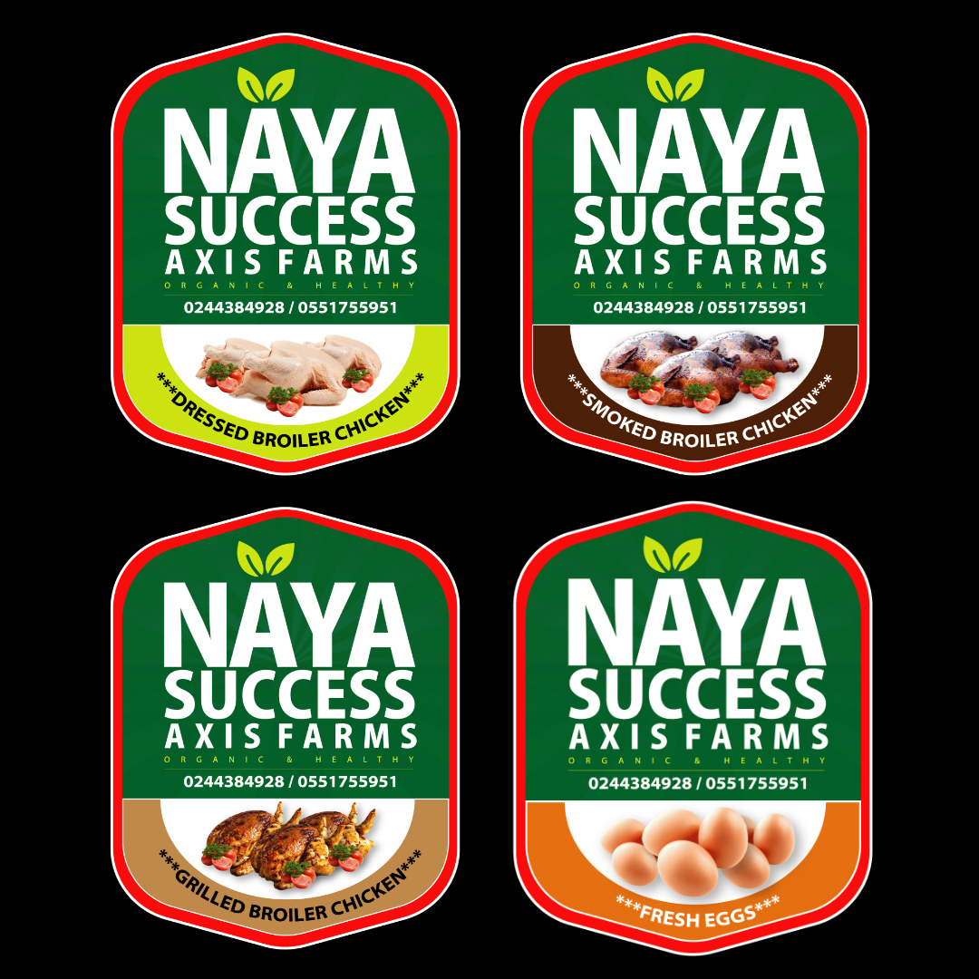
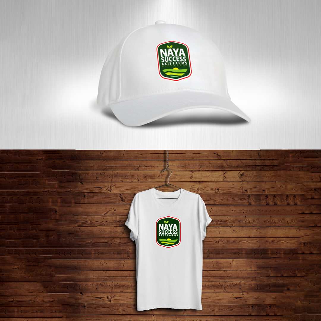
For Naya Success Axis Farms, I designed a family of product labels covering multiple SKUs — dressed broiler chicken, smoked chicken, grilled chicken, and fresh eggs — alongside branded merchandise that extended the farm's identity beyond the product itself.
What I deliver: Brand identity systems, product packaging, merchandise design, vehicle branding, in-store visuals, and brand guidelines that keep your business looking sharp at every touchpoint.
360 Campaign
"A great campaign doesn't just inform. It moves people to act."
Campaigns are where strategy meets creativity — and I thrive at that intersection. My 360 Campaign work goes beyond designing a single flyer. I think about the full customer journey: how do we capture attention, build excitement, drive participation, and deliver a memorable experience?
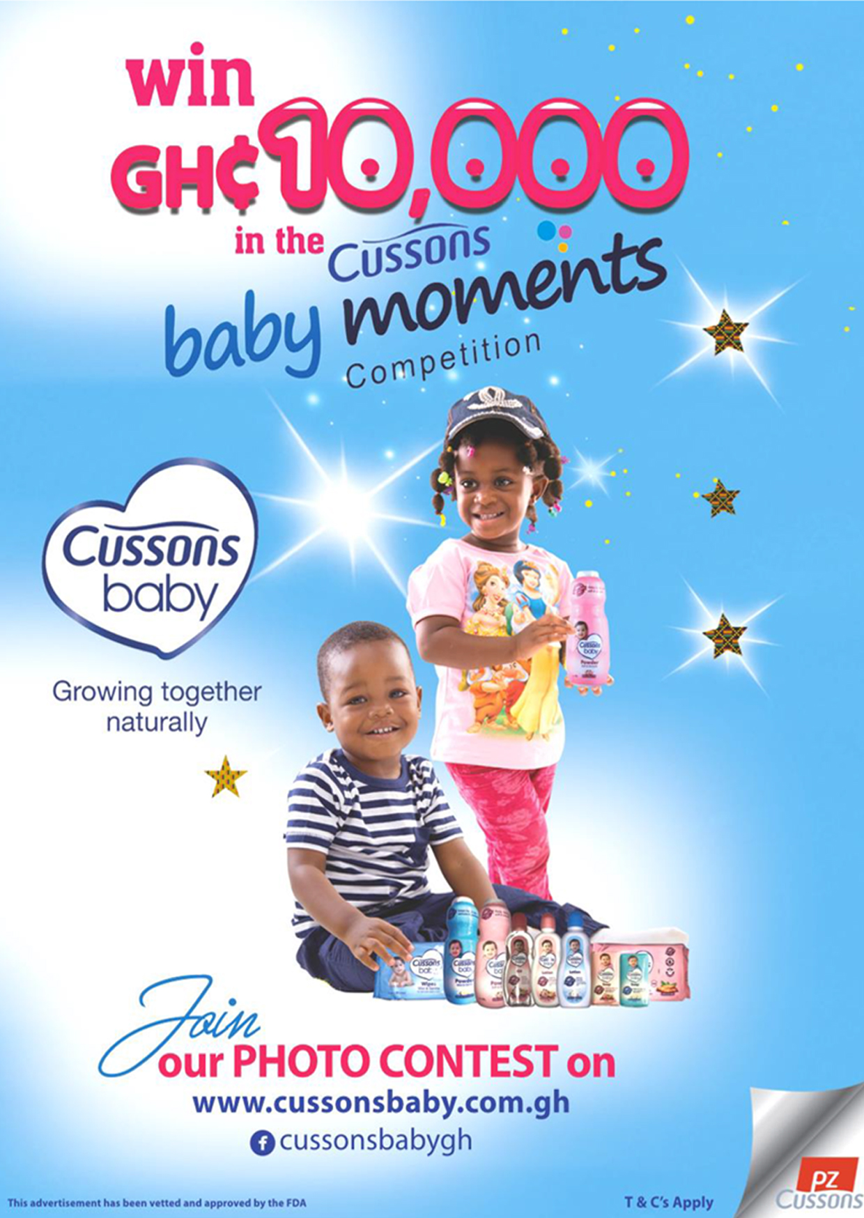
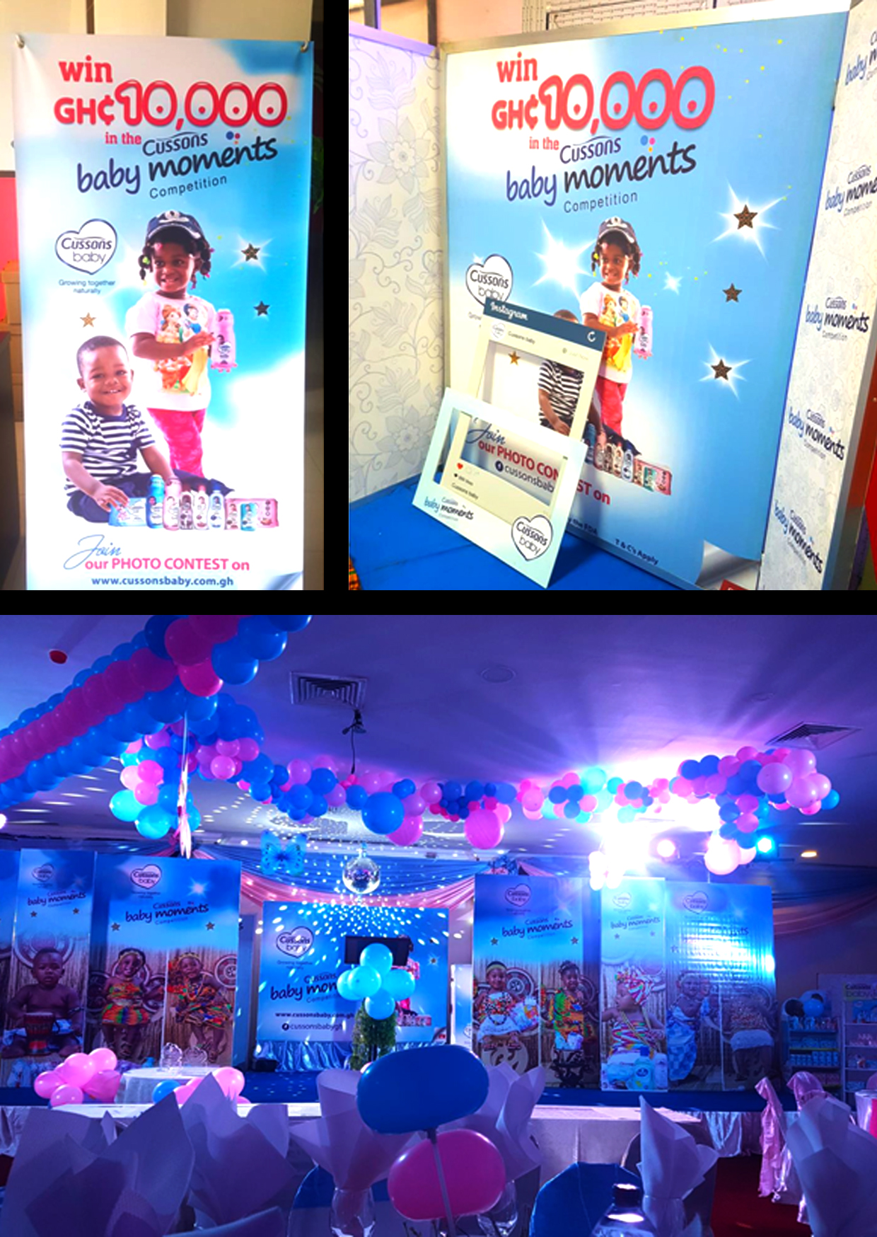
For Cussons Baby Ghana, I led the visual execution of the Baby Moments Competition — a consumer engagement campaign that invited parents to share precious moments for a chance to win GH₵10,000. I developed the campaign poster, large-format rollup banners for retail and activation points, and the event décor for the grand finale — creating a warm, celebratory atmosphere that perfectly matched the Cussons Baby brand promise of "Growing Together Naturally."
Every element — from the sparkles on the poster to the pink and blue balloons at the event — was intentional, consistent, and designed to make families feel seen and celebrated.
What I deliver: Campaign concept visualization, print and digital campaign assets, activation materials, event branding, and end-to-end visual consistency across all campaign touchpoints.
360 Events
"An event is a brand experience. Every visual detail shapes how people feel in that room."
Events are one of the most powerful moments a brand has to connect with its audience in real life — and the visuals have to match the energy of the moment. My 360 Events work covers everything from pre-event promotion to on-the-night branding, ensuring a seamless, professional, and exciting visual experience.
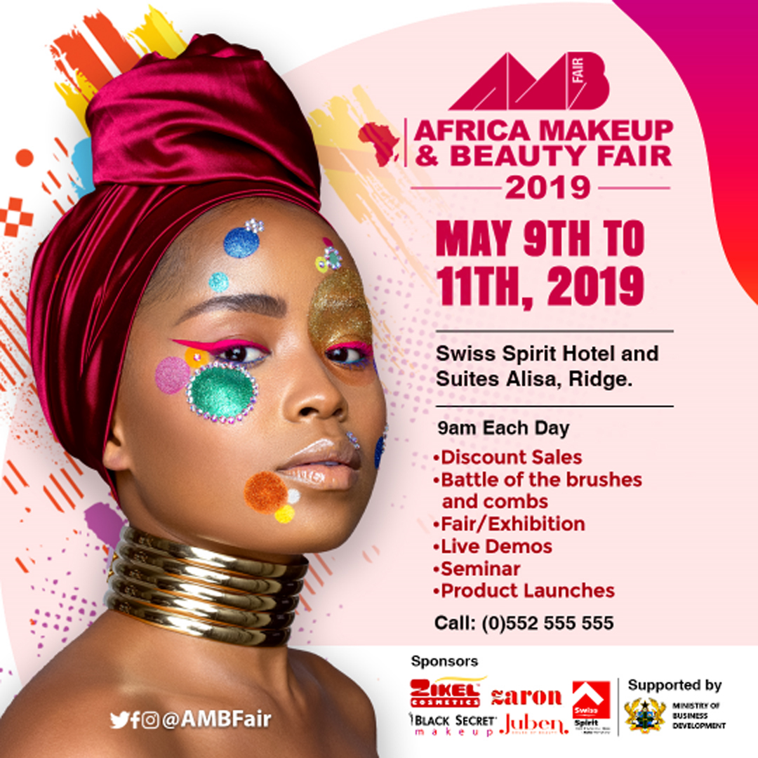
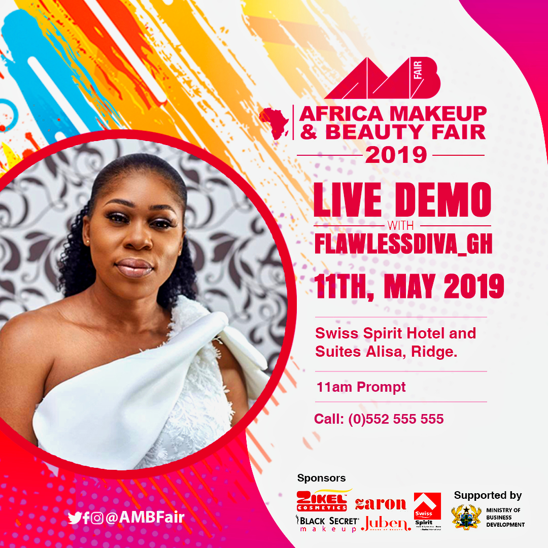
For the Africa Makeup & Beauty Fair (AMBFair) 2019, I created a suite of event promotional materials including the main event poster, rollup banners, and live demo announcements — all carrying a vibrant, high-energy aesthetic that reflected the creativity and glamour of the beauty industry.
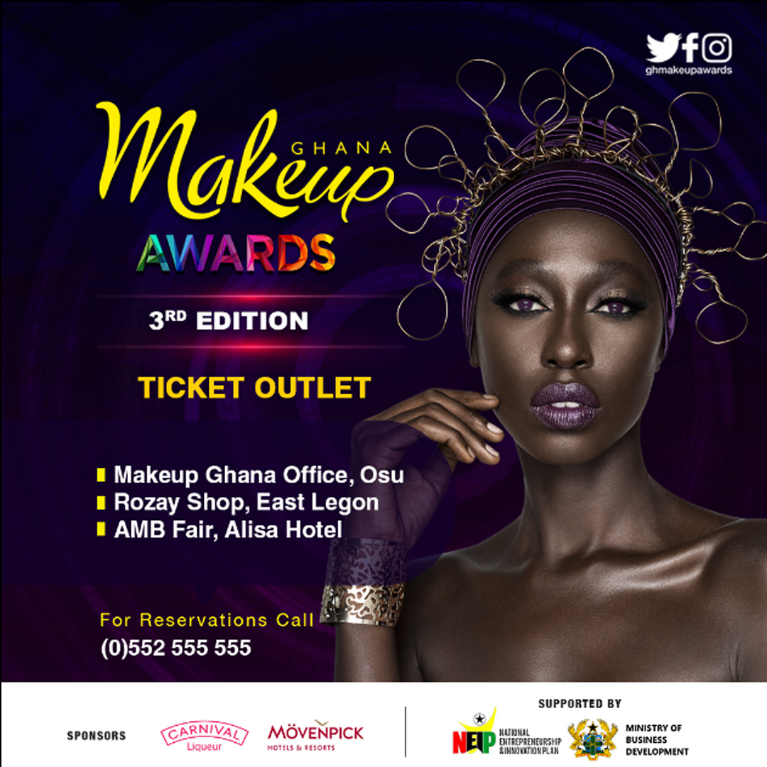
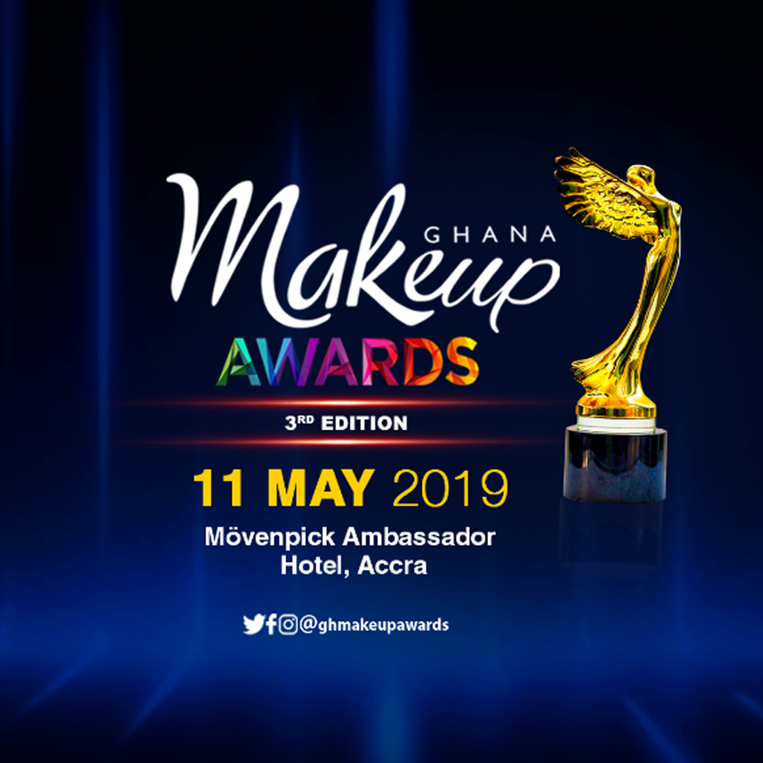
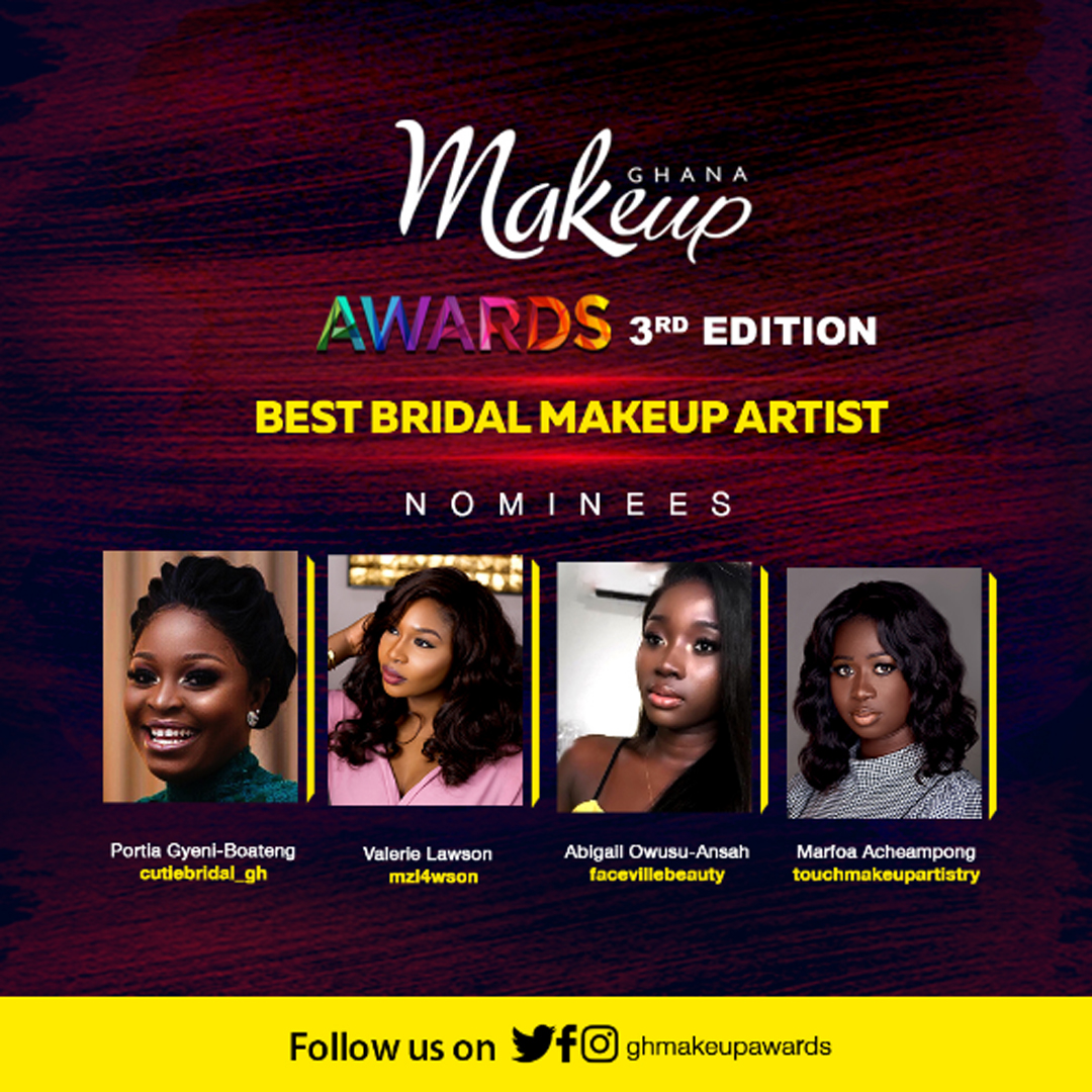
For the Ghana Makeup Awards 3rd Edition, I designed the full promotional campaign — from ticket outlet announcements and nominee reveal graphics to the event date and venue cards — building anticipation and prestige around one of Ghana's most celebrated beauty events.
What I deliver: Event identity design, promotional posters, rollup banners, nominee and announcement graphics, sponsor recognition visuals, and on-site branding materials.
Logos
.jpg)
.jpg)
.jpg)
.jpg)
.jpg)
.jpg)
.jpg)
.jpg)
.jpg)
"A great logo says everything without saying a word."
A logo is the foundation of every brand. It must be simple enough to be remembered, bold enough to stand out, and flexible enough to work everywhere — from a business card to a billboard. My logo design work spans industries, sizes, and audiences, and every mark I create is built with purpose and intentionality.
My logo portfolio includes brands across a wide spectrum:
- →Voice of Victory Radio — a clean, authoritative mark that communicates trust and reach
- →DataPlas — a modern, tech-forward identity for a data-driven consulting firm
- →Michrone Clothing — a bold, youthful fashion logo with attitude
- →Twinkys — a playful, colorful mark designed for a baby and kids brand
- →Mamaga Quality Food — a warm, inviting logo rooted in heritage and appetite appeal
- →Frank Owusu Foundation — a professional, credible identity for an NGO
- →Event Adventure, Berlin Cosmetics, JSA Printing, VacQstr, and many more
Each logo was crafted after deep understanding of the client's vision, target audience, and competitive landscape.
What I deliver: Primary logo design, logo variations (light/dark, icon-only, stacked), color palette development, typography selection, and brand mark guidelines.
Brochure/Flyers
"Good design doesn't just look beautiful — it communicates clearly and drives results."
Print and digital collateral remain some of the most powerful tools in any marketing mix — and the difference between a forgettable flyer and one that gets results is thoughtful design. I create brochures and flyers that are visually striking, strategically structured, and always on-brand.
My work in this category spans some of Ghana's most recognized institutions and consumer brands:
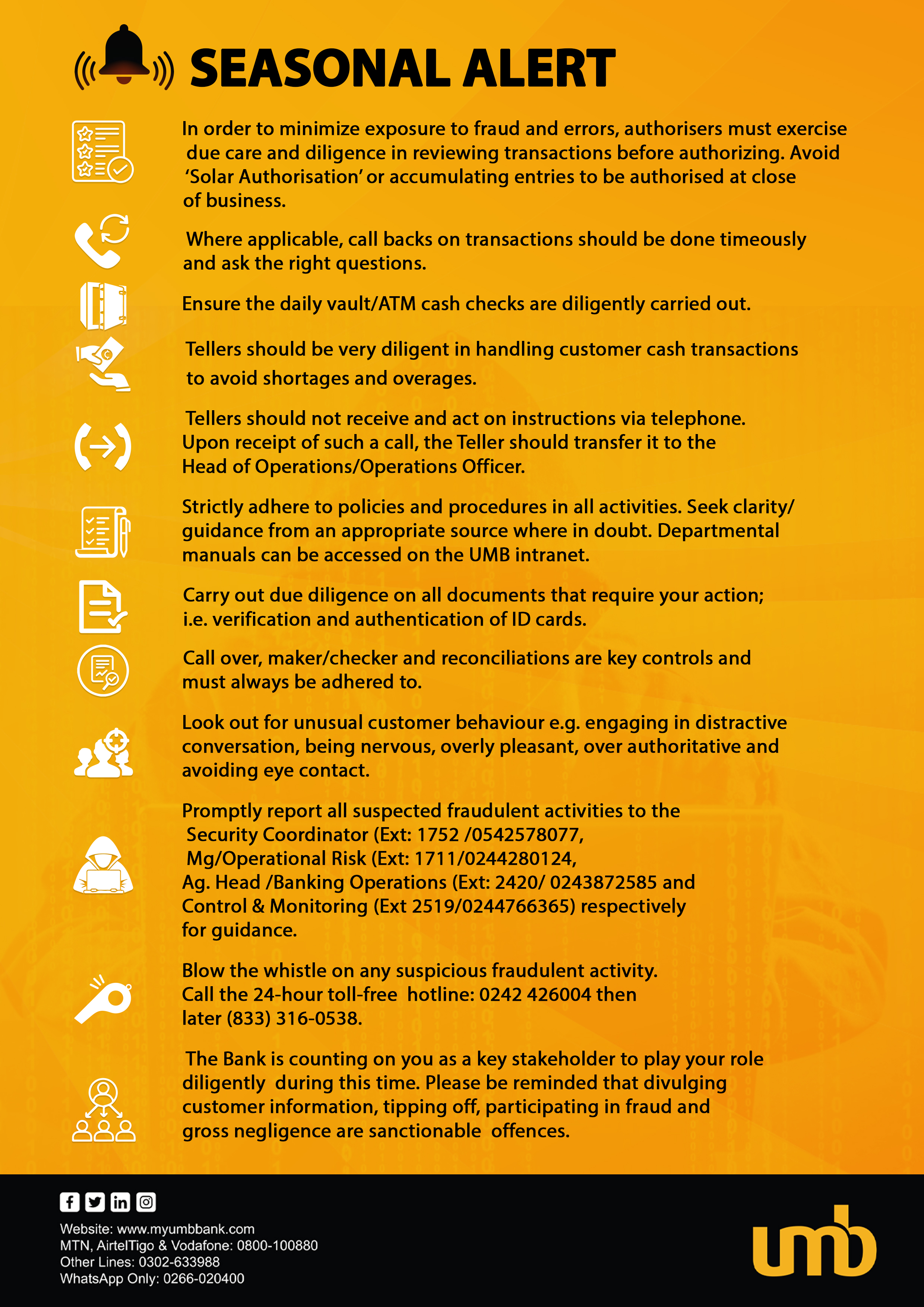
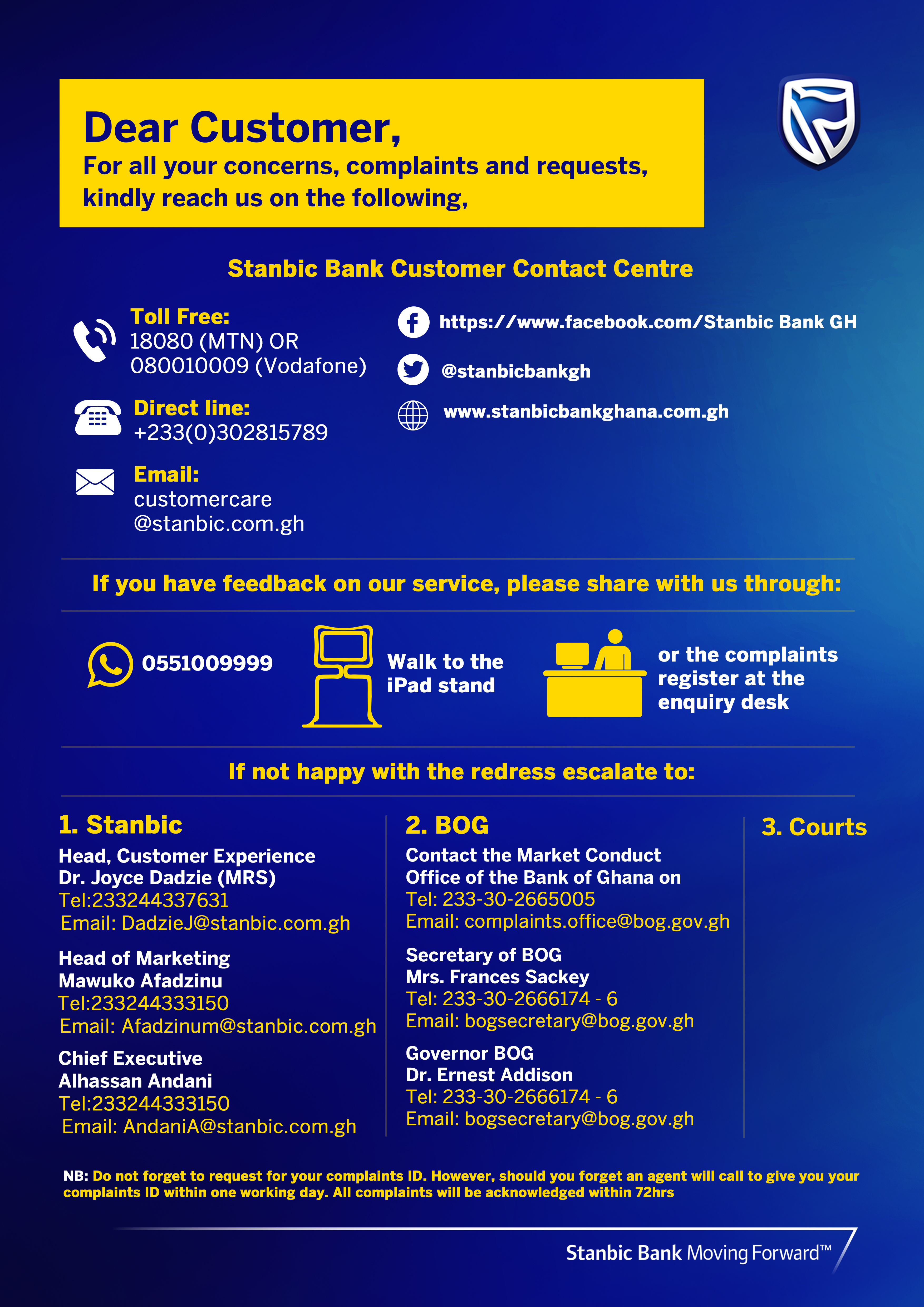
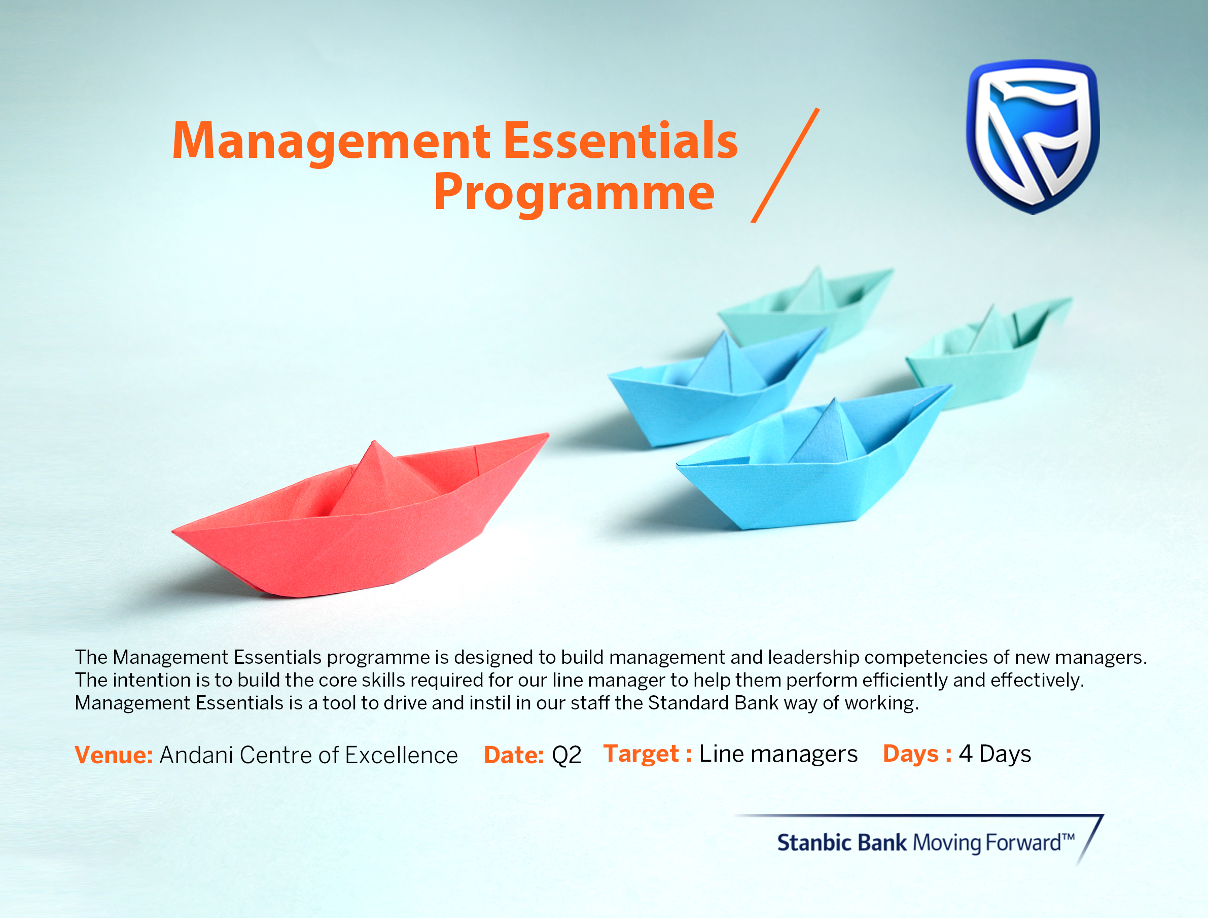
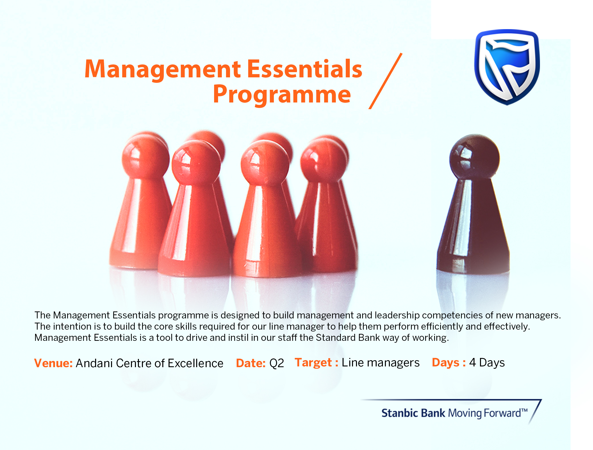
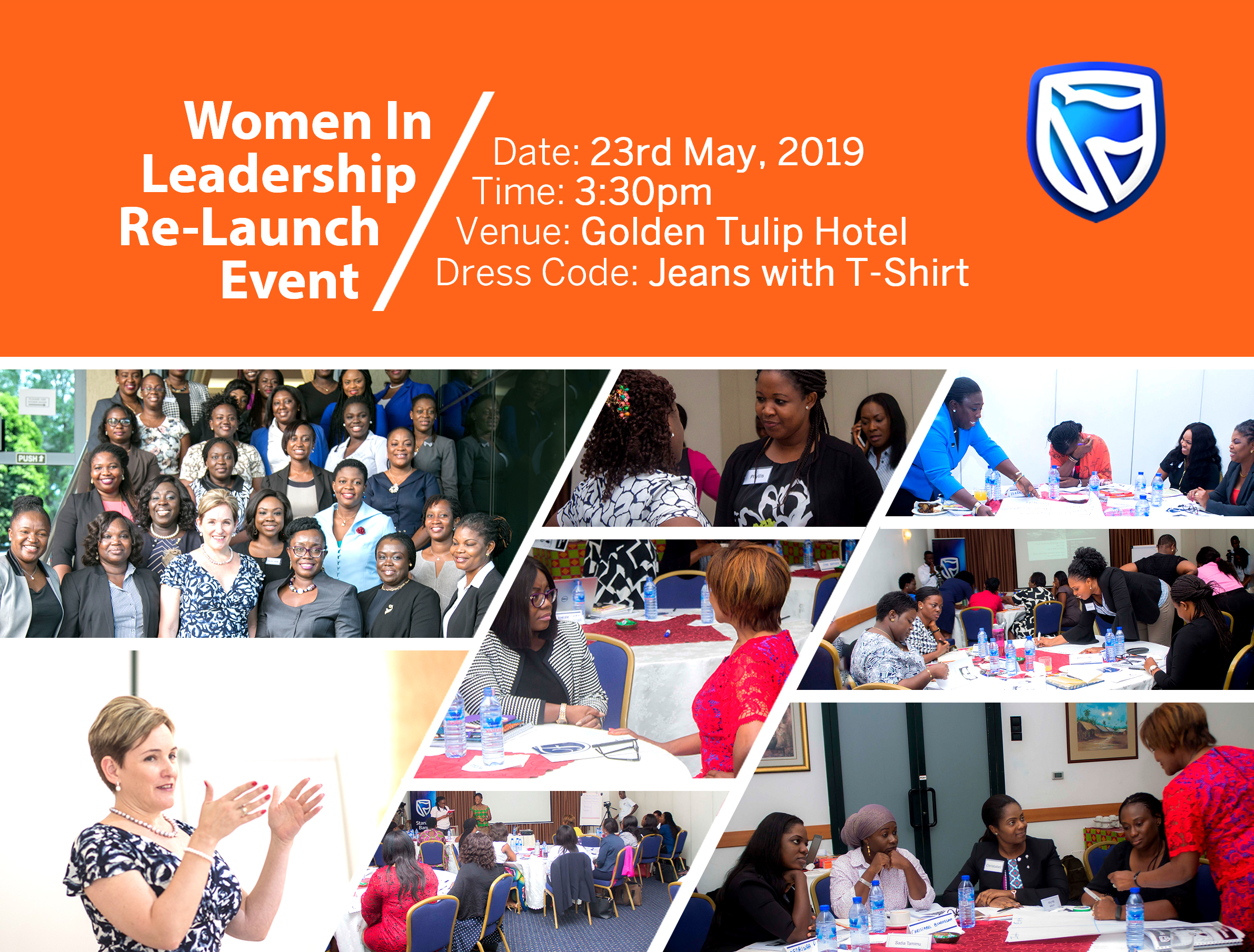
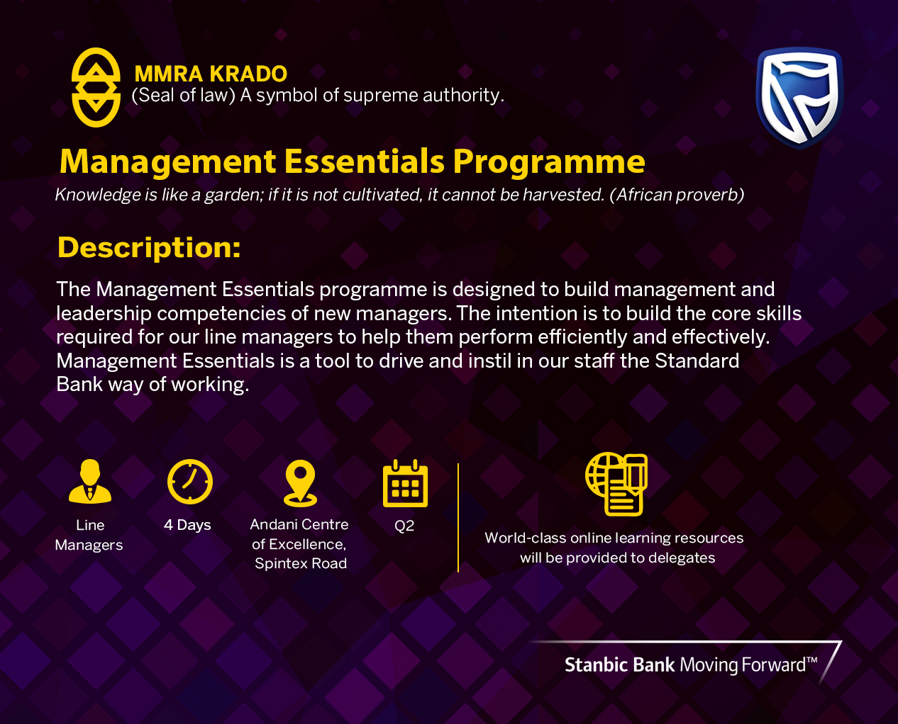
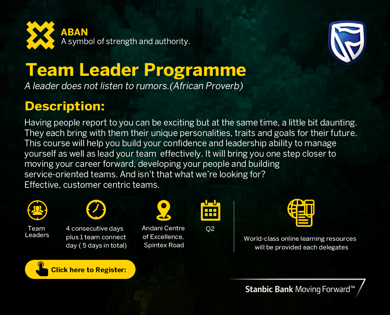
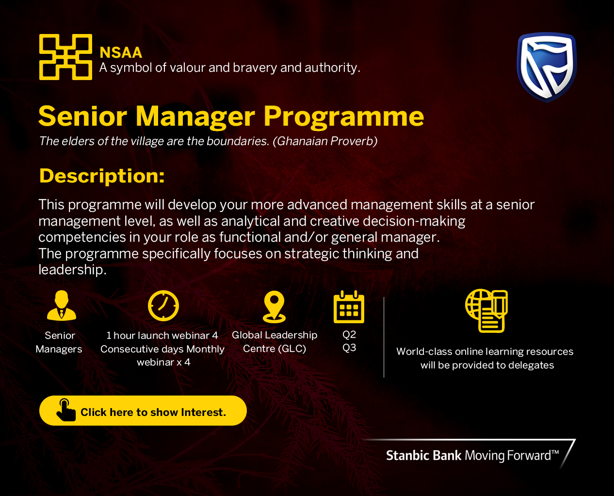
For Stanbic Bank Ghana, I designed internal compliance communications, training programme brochures for the Management Essentials, Team Leader, and Senior Manager Programmes, and customer-facing fraud alert notices — all balancing the bank's corporate identity with clear, accessible information design.
For UMB Bank, I produced customer service communications that were professional, warm, and action-oriented.
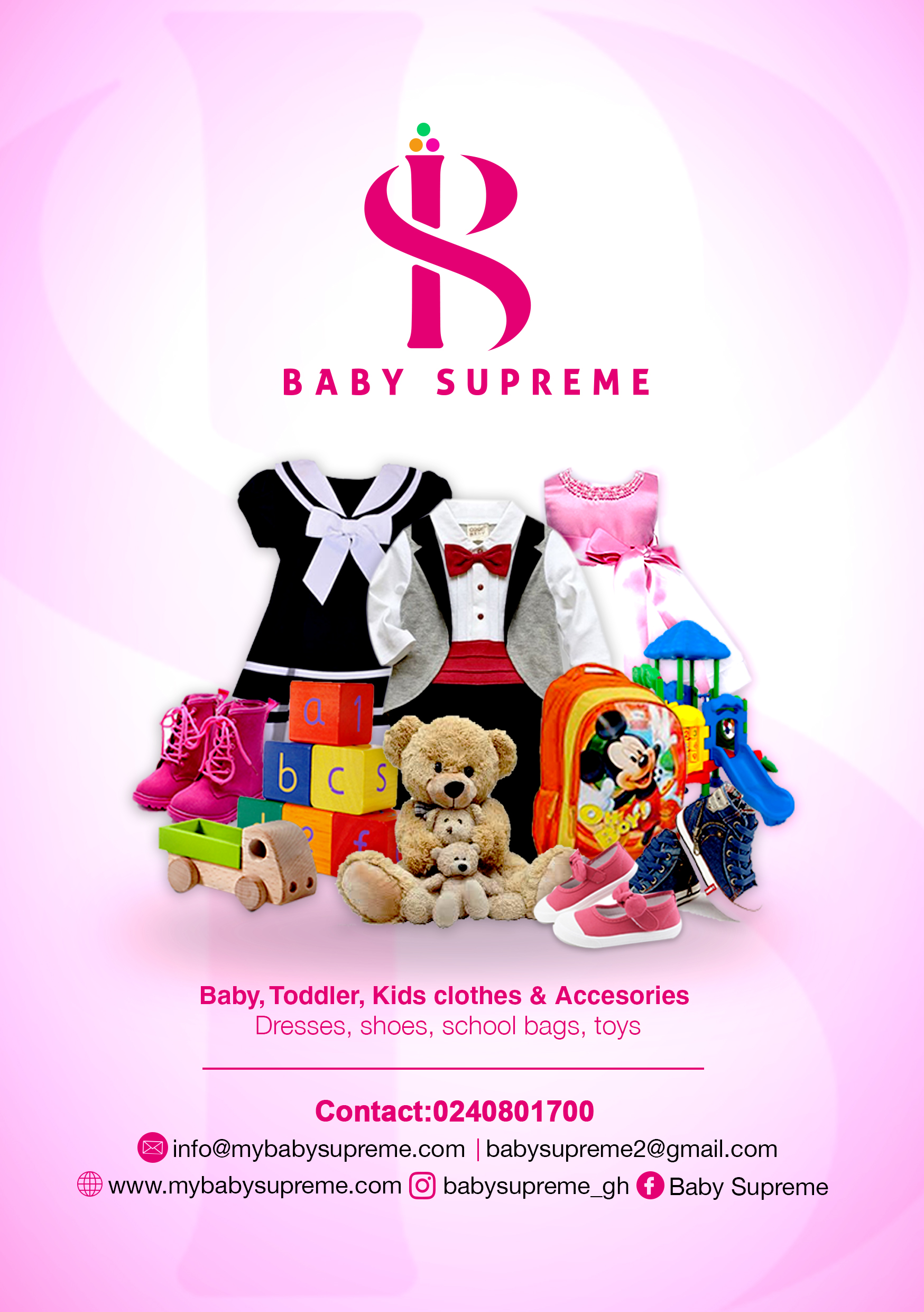
For Baby Supreme, I created retail flyers that were bright, inviting, and perfectly targeted to parents of young children.
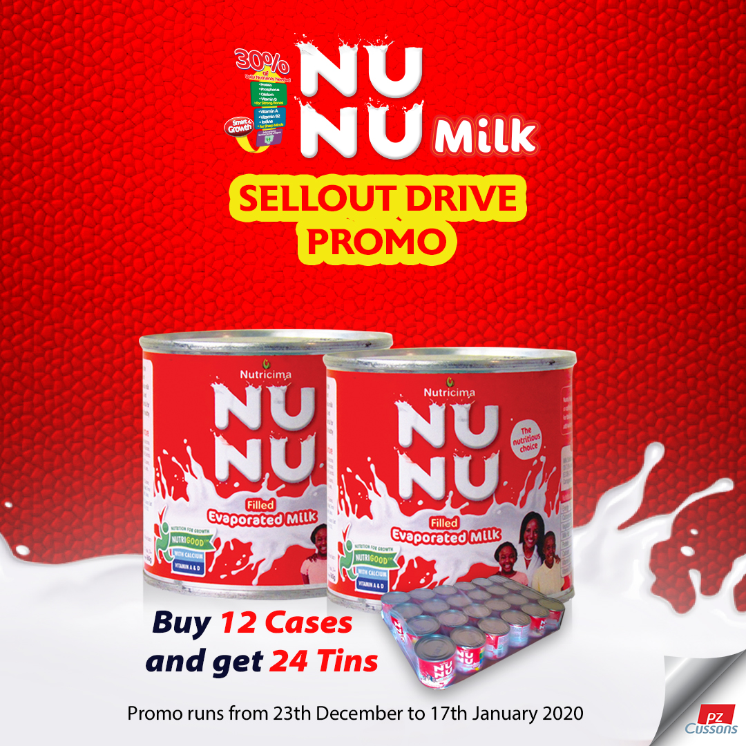
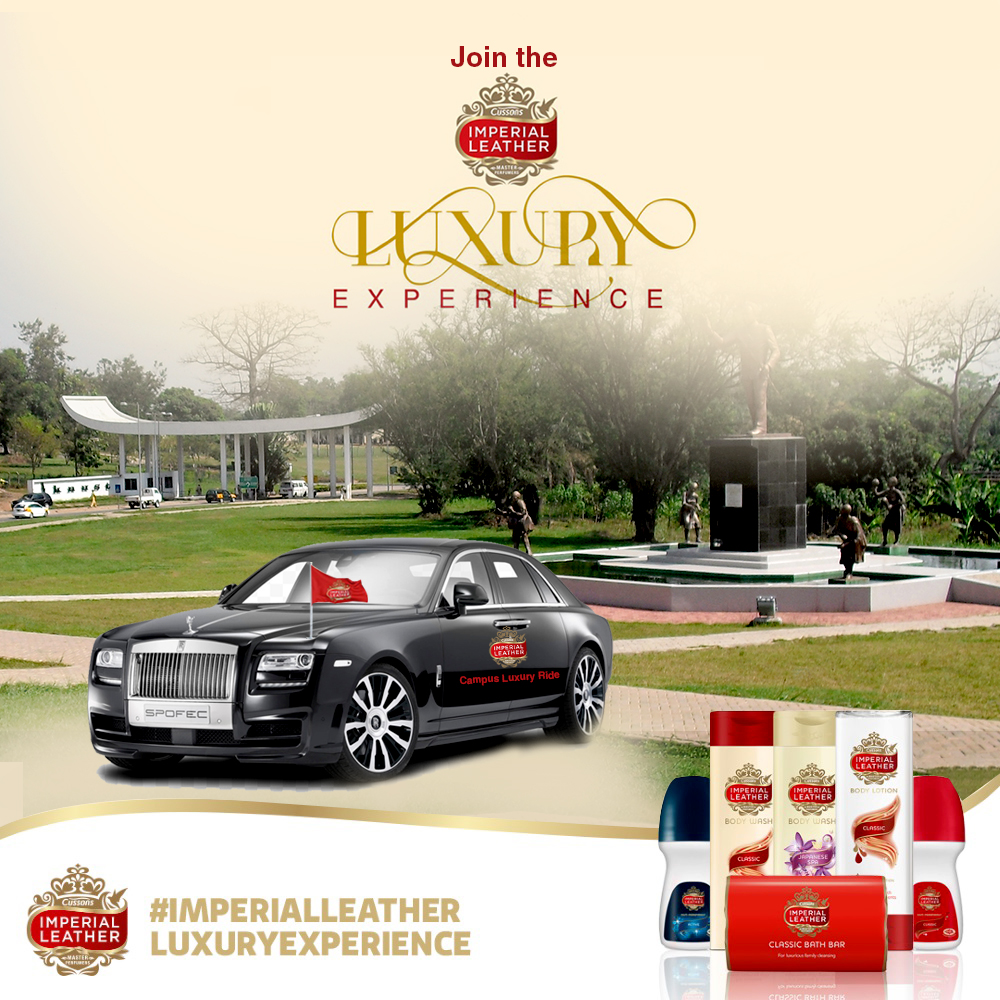
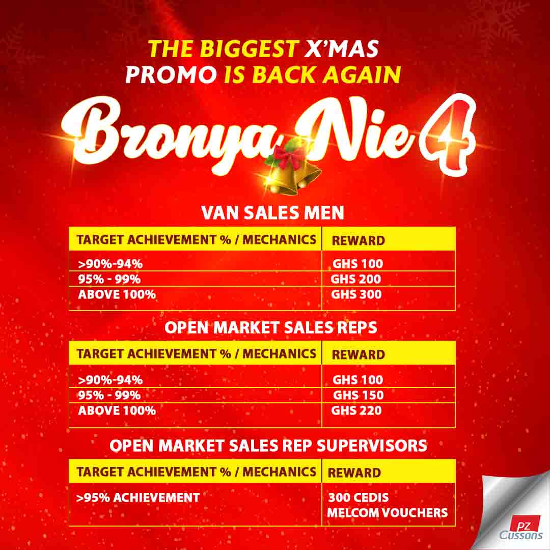
For Nu Nu Milk, Imperial Leather, and Bronya Nie, I designed promotional flyers that drove consumer engagement and sales activations.
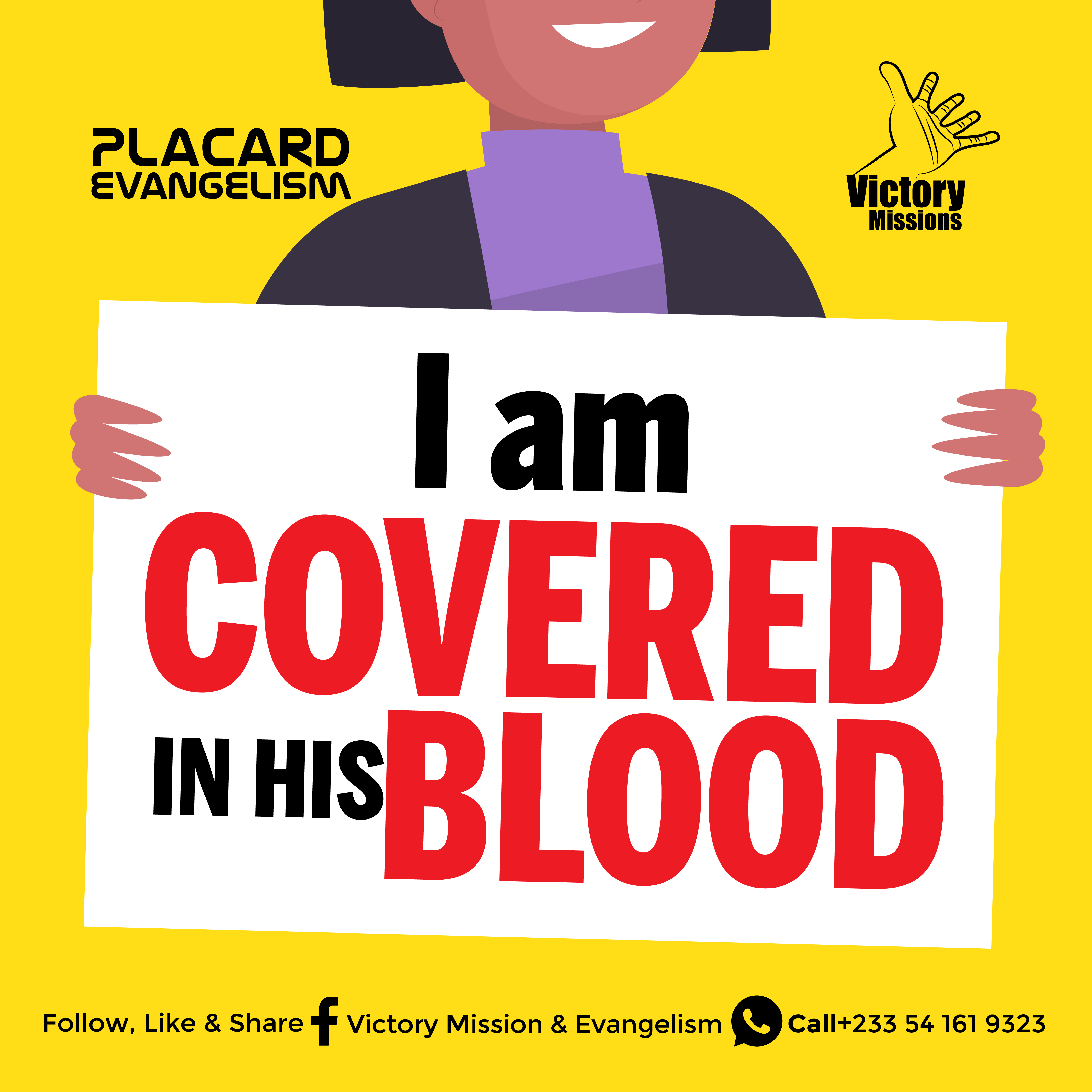
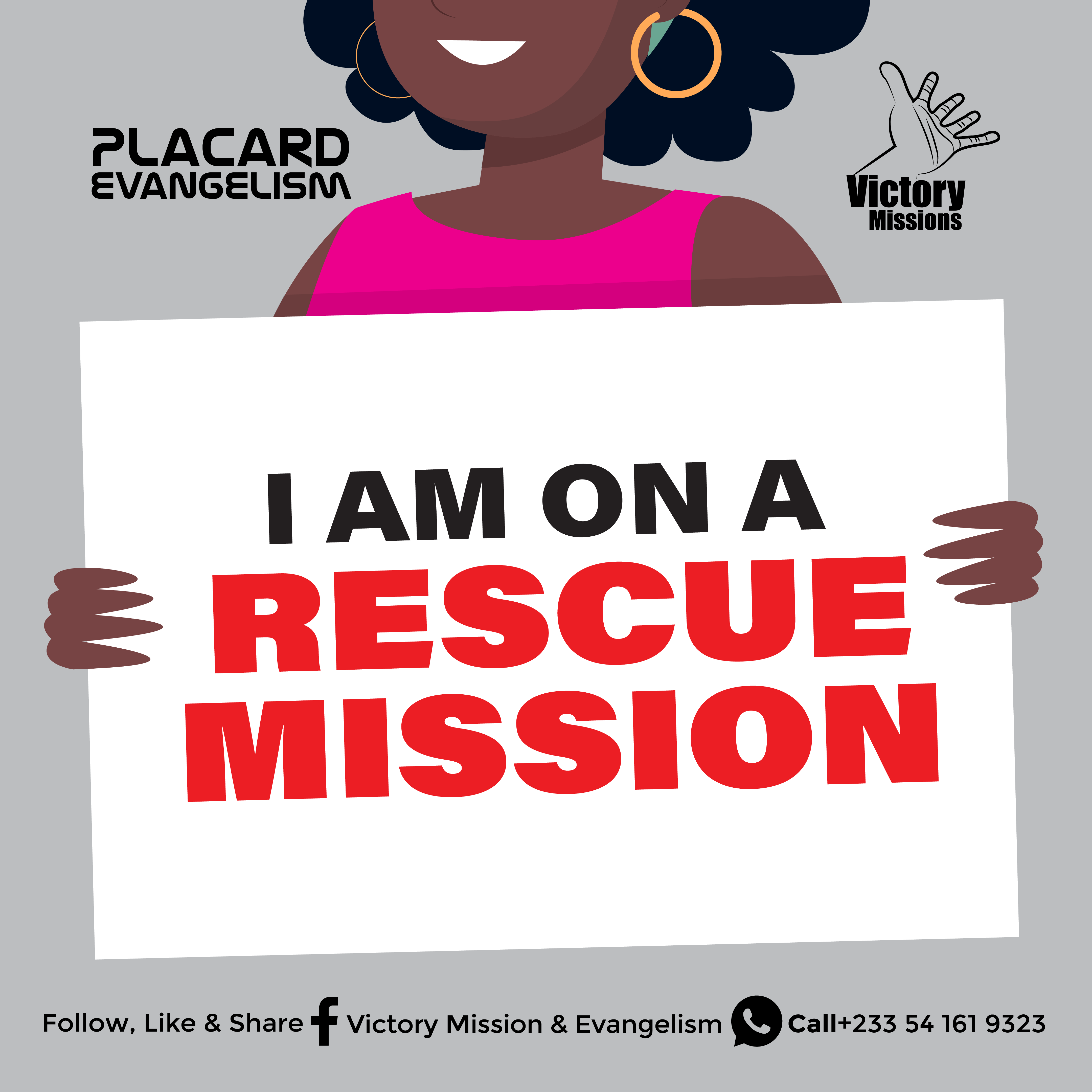
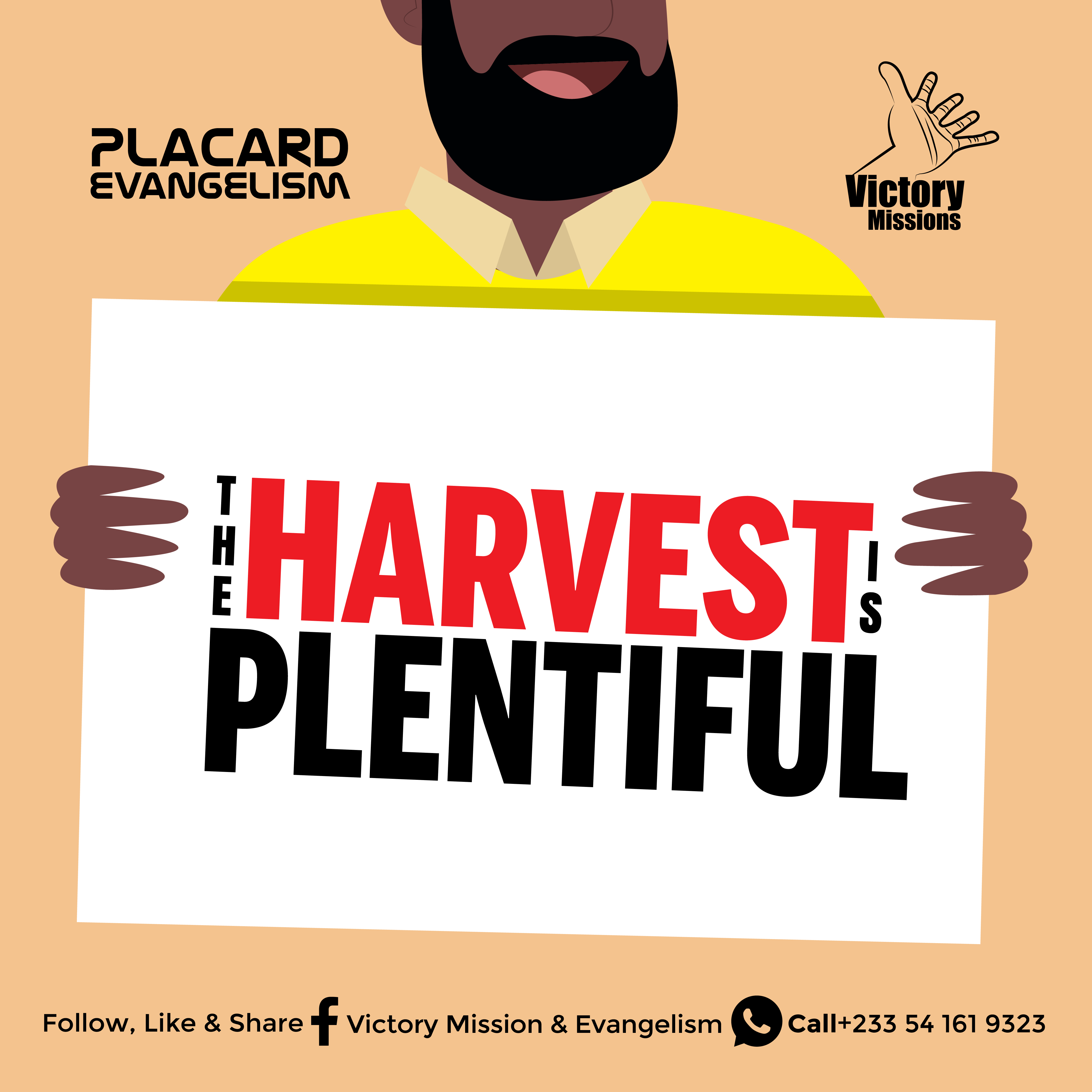
I also created social message designs for Victory Mission & Evangelism and bold typographic content for a variety of campaigns — proving that great design works across sacred and commercial spaces alike.
What I deliver: Corporate brochures, promotional flyers, training and programme materials, compliance communications, retail promotional designs, and digital-ready flyer assets.
Social Media Designs


"In a world of endless scrolling, your brand has 3 seconds. Make them count."
Social media is the new storefront — and your visuals are the first handshake. I design social media content that doesn't just look good in the feed; it stops the scroll, communicates clearly, and drives engagement.
My social media design work has supported some of the most exciting brands and events in Ghana's creative and consumer space:
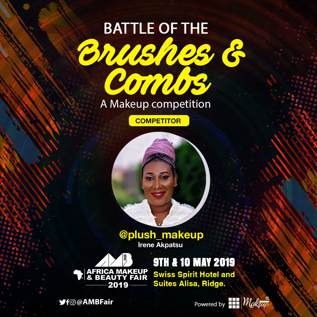
For the Africa Makeup & Beauty Fair, I developed a series of high-impact posts announcing live demos, featuring competitors, and building event hype — each post visually cohesive yet individually eye-catching.
For Ghana Makeup Awards, I created honorary award announcements and event countdown posts that built prestige and anticipation across platforms.
For Baby Supreme, I designed warm, lifestyle-driven product posts that connected emotionally with parents and caregivers.
For Imperial Leather, I crafted aspirational luxury content that elevated the brand's positioning in the market.
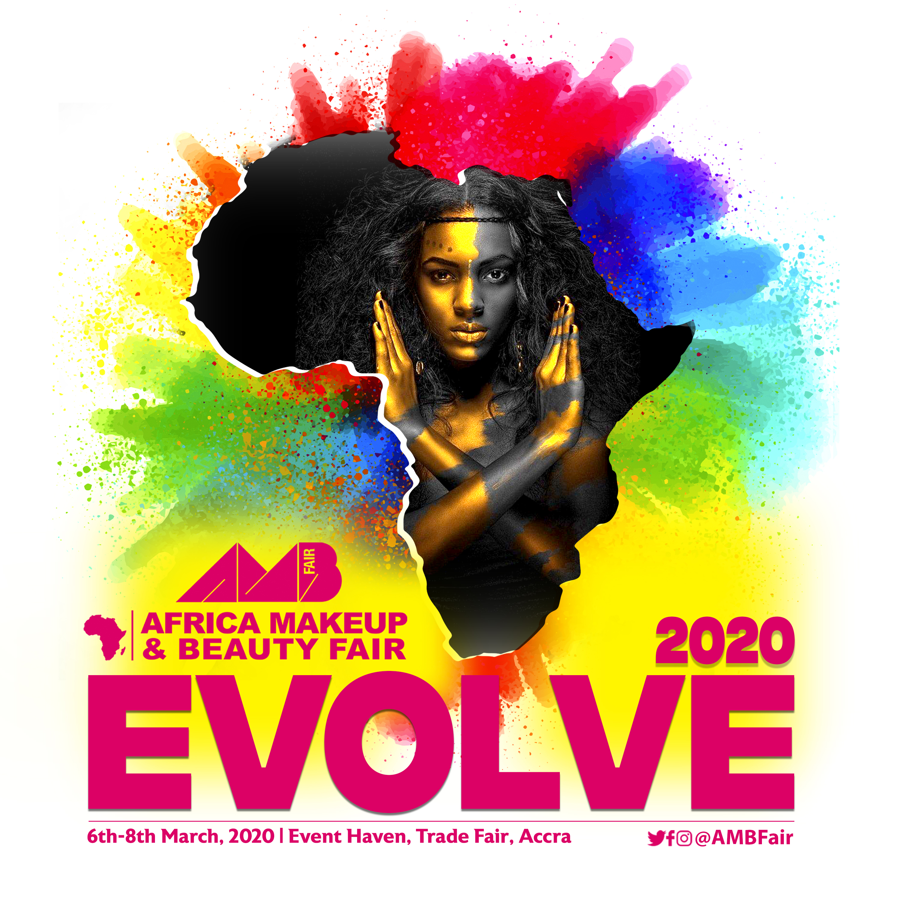
For AMBFair 2020 "Evolve", I designed a bold, Afrocentric theme-reveal graphic that generated significant organic buzz.
Across every client, my social media designs are built with platform best practices in mind — optimized for Instagram, Facebook, and Twitter, and always aligned with the brand's voice and audience.
What I deliver: Social media post designs, event announcement graphics, product promotion content, award and nominee graphics, story formats, and content template systems for consistent brand presence.
Branding
"The details are not the details. The details are the design."
A brand is only as strong as its weakest touchpoint. That's why I pay obsessive attention to the materials that represent a business in the real world — the letterhead on a proposal, the business card exchanged at a meeting, the package a customer picks off a shelf. These moments matter, and I design them to leave a lasting impression.
My stationery and packaging work includes:
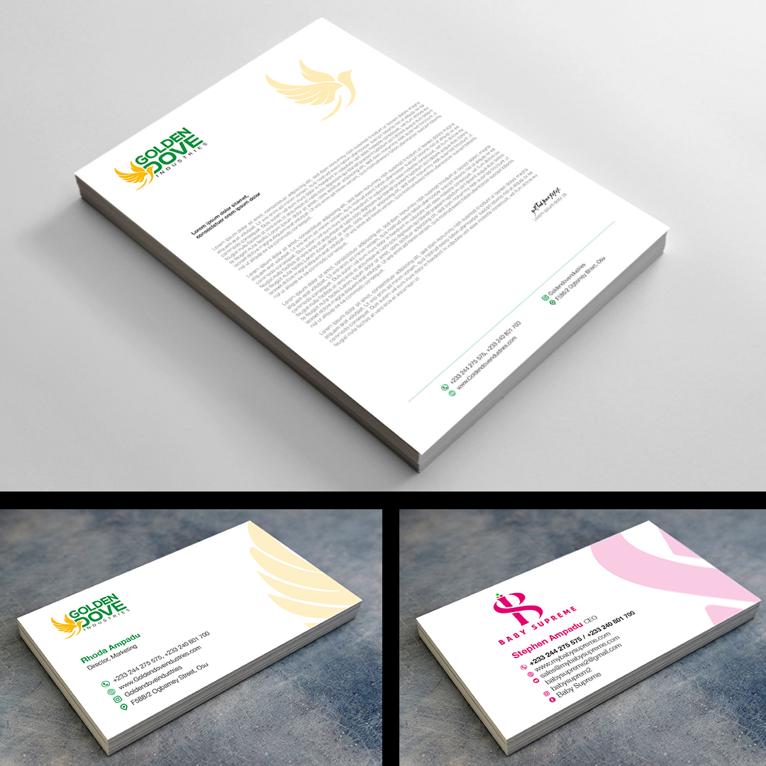
Corporate Stationery — For brands like Golden Dove and Choice, I developed complete stationery suites including letterheads and business cards that communicate professionalism and brand pride from the first line of text.
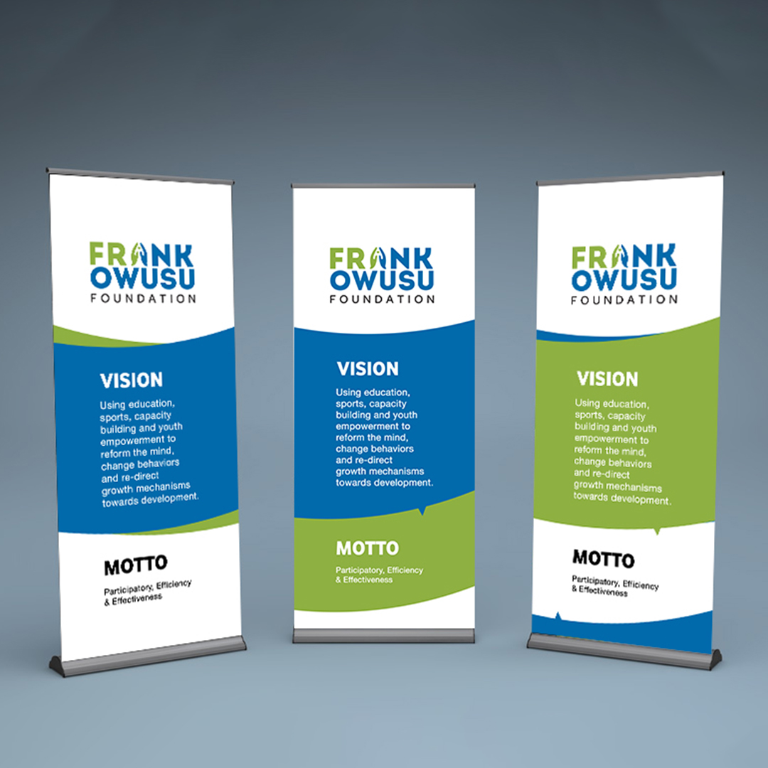
Rollup Banners — For the Frank Owusu Foundation, I designed a series of branded rollup banners presenting the organization's vision and motto in a clean, impactful layout suitable for conferences, schools, and community events.
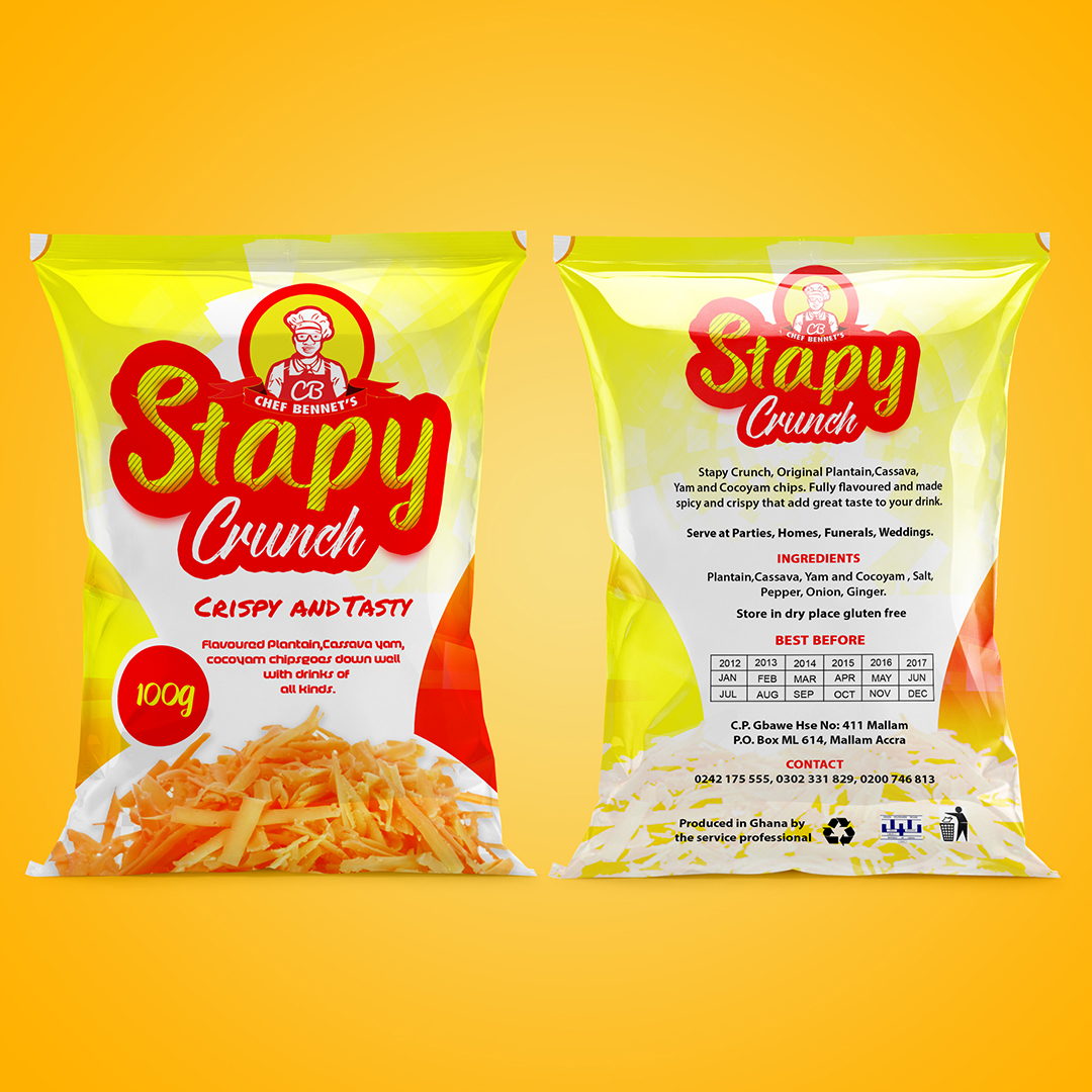
Retail Packaging — For Stapy Crunch, I designed vibrant, shelf-ready snack packaging that combined appetite appeal with clear product information — making the brand competitive and attractive at point of sale.
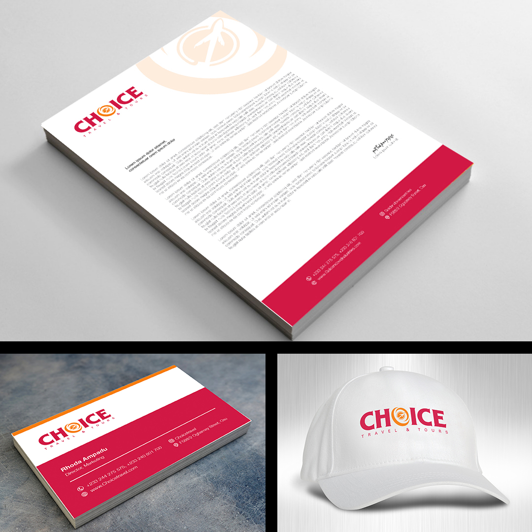
For Choice brand, I extended the identity across business cards, letterheads, and branded caps — demonstrating how a consistent visual system builds brand recognition across everyday objects.
What I deliver: Letterhead design, business card design, branded merchandise, rollup and pull-up banners, retail packaging, and full stationery suites ready for print production.
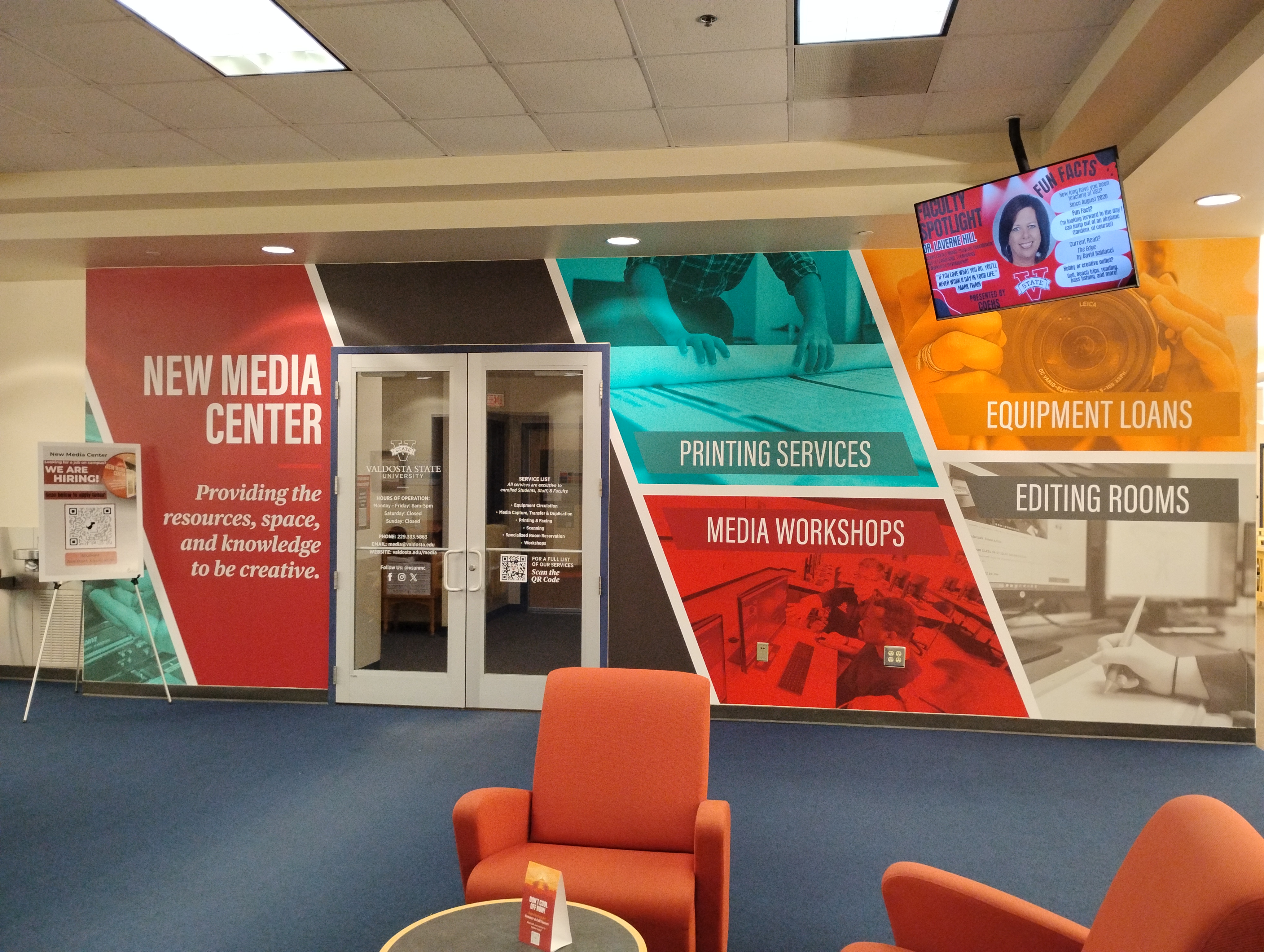
New Media Center Environmental / Large-Format Branding
Media
Center
Services
Loans
Rooms
What does someone need to know in the first five seconds?
Before touching a single colour or font, a single strategic question was posed. The answer to that question became the structural backbone of everything that followed.
/ Welcome
Energy
Confidence
Services
Craft
Production
Loans
Access
Possibility
Rooms
Professionalism
Calm
A wall that does the work of a brochure, a signpost, a brand statement, and a welcome — all at once.
Media
Center
"The details are not the details. The details are the design."
Client: Valdosta State University New Media Center
Medium: Large format wall graphics / Environmental branding
Scope: Full-wall visual identity system for a university media facility entrance
Audience: Students, Faculty & Staff
The challenge was straightforward but demanding. Designing a wall that does the work of a brochure, a signpost, a brand statement, and a welcome message all at once, in the time it takes someone to walk past it.
THE DESIGN THINKING
"Before I touched a single colour or font, I asked one question: what does someone need to know in the first five seconds of seeing this wall?"
The answer was three things: Who this space is for, What it offers, And why it matters.
Everything in this design flows from that single strategic decision.
THE EXECUTION
Diagonal Panel Architecture — The bold diagonal layout is not decorative. It is structural storytelling. The angled panels create visual movement that pulls the eye from left to right, naturally guiding the viewer through the content in the same order they need to receive it:
Brand identity first → Services second → Supporting details third.
This mirrors the exact journey a first-time visitor takes mentally when approaching an unfamiliar space.
Colour-Coded Service System
Each service panel carries its own distinct colour, intentionally chosen to create instant differentiation without requiring the viewer to read every word first:
- Deep Red — Brand Identity / Welcome: Authority, energy, confidence
- Teal / Cyan — Printing Services: Precision, craft, production
- Orange / Amber — Equipment Loans: Warmth, access, possibility
- Charcoal Grey — Editing Rooms: Focus, professionalism, calm
This colour-coding system means a returning student can navigate the wall without reading it. They know exactly where to look for the information they need.
Typography Hierarchy
The typographic system operates on three clear levels:
- Level 1 — New Media Center (largest, white on red): The brand name. Unmissable. Anchors the entire composition.
- Level 2 — Service Labels (bold, all-caps, white): Printing Services. Media Workshops. Equipment Loans. Editing Rooms. Scannable. Functional. Direct.
- Level 3 — Supporting copy (italic, smaller weight): "Providing the resources, space, and knowledge to be creative." — The emotional layer. It humanizes the brand and tells the viewer not just what this place does, but why it exists for them.
What I deliver: Large-format environmental wall graphics, entrance identity systems, colour-coded wayfinding, typographic hierarchy systems, QR code integration, and print-ready files for wide-format production.
Multi-Platform Internal Communication & Event Identity System

"The details are not the details. The details are the design."
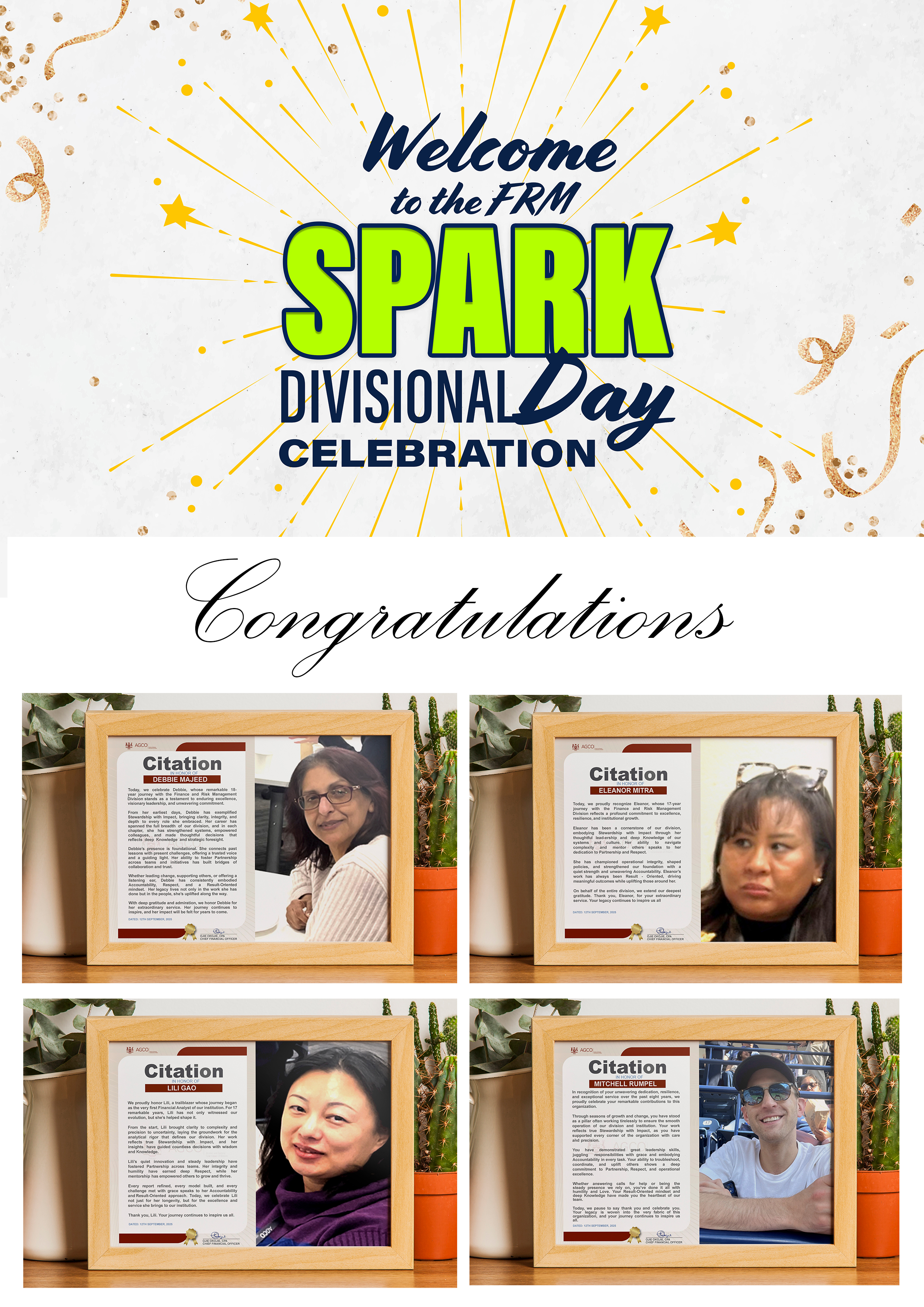
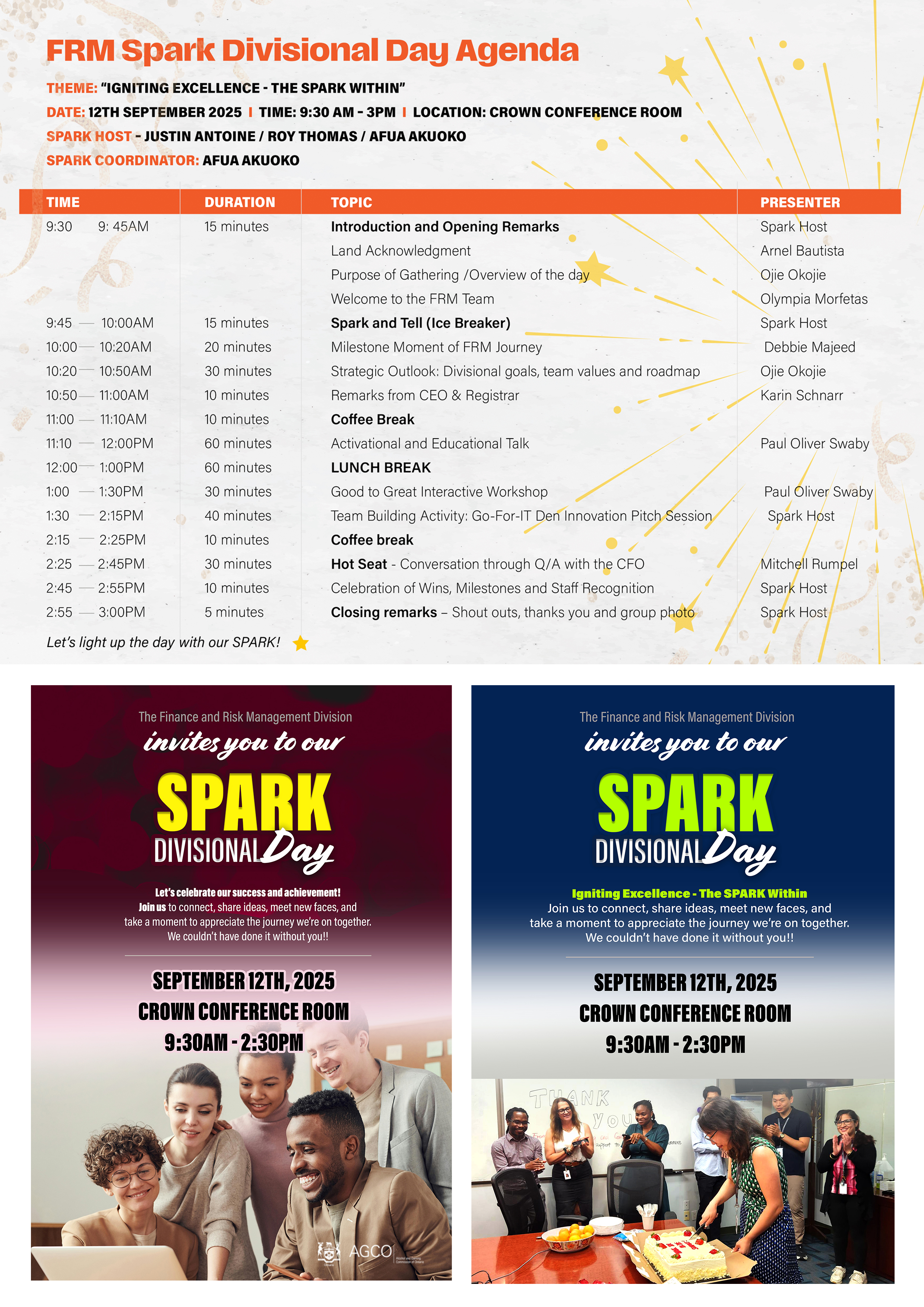
Client: AGCO – Finance & Risk Management (FRM) Division
Format: Multi-Platform Internal Communication & Event Identity System
Scope: Brand Design · Editorial Layout · Presentation Design · Motion Graphics · Print Production · Event Visual Identity
Project: A complete visual communication system developed for the Finance and Risk Management (FRM) Division of AGCO for its inaugural SPARK Divisional Day — designed to unify storytelling, strategy communication, celebration, and culture-building across multiple formats without losing identity, clarity, or impact. This is the first divisional-wide event following the separation from the Corporate Division, making visual consistency and narrative clarity essential to shaping the identity of the new FRM Division.
Deliverables: Event Agenda Design · Strategic Presentation Decks · Divisional Documentary Visual Package · Event Posters · Invitation Gingle (Animated Visuals) · Photography Backdrop Design · Internal Communication Assets
The Idea
"Igniting Excellence – The SPARK Within."
One division. One identity. One moment of alignment.
Every format. Every touchpoint. One unified story of transformation, direction, and pride.
The Work
Agenda (Event Flow Design): A structured, visually engaging agenda designed to guide participants through the SPARK Divisional Day experience. Built with clear hierarchy, time flow, speaker identity, and thematic segmentation (Opening Spark, Milestone Magic, Vision Sparks, Power Talk, etc.). Designed for both print and digital use to ensure accessibility and consistency.
Presentation Decks (Strategic Communication System): A cohesive set of presentation designs covering: FRM Goals and Priorities (as defined by SLT), Division Values and Culture Framework, and Strategic "Way Forward" and Future Direction. Each deck uses a unified SPARK visual system to ensure leadership messaging is clear, structured, and visually aligned across all sessions.
Documentary Visual Package (Divisional Storytelling System): A motion and visual identity package that tells the story of FRM's evolution from Corporate Division to an independent unit, including: intro and outro motion graphics, timeline of divisional formation and growth, lower-third graphics for speakers and milestones, and visual storytelling elements highlighting key achievements and people. This creates a cohesive narrative of identity, transition, and purpose.
Event Posters (Print & Digital Communication Suite): A series of branded posters designed for event announcement and awareness, session highlights (Ice-Breaker, Milestone Magic, Vision Sparks, Power Talk), speaker and leadership visibility, and internal engagement and anticipation building. All materials maintain a consistent SPARK visual identity system.
Invitation Gingle (Animated Digital Asset): A short animated visual invitation designed for internal communication channels, capturing the energy of the SPARK theme through motion, typography, and sound cues — encouraging participation and engagement.
Photography Backdrop (Event Experience Design): A branded step-and-repeat backdrop designed for event photography, ensuring consistent visual identity across all captured moments and reinforcing division branding throughout the event experience.
The Result: A unified, multi-platform visual identity system that transforms the SPARK Divisional Day into more than an event — it becomes a defining moment of identity formation for the Finance and Risk Management Division. From presentations to posters, from digital motion to print materials, every touchpoint reinforces the same message: This is a new division. This is its direction. This is its SPARK.
What I deliver:
Fully designed SPARK Divisional Day agenda (print + digital formats),
Leadership presentation decks (Goals, Values, Strategic Direction),
Divisional documentary visual identity system (motion graphics + overlays),
Event poster suite (print and digital formats),
Animated invitation gingle for internal communication,
Branded photography backdrop design,
Unified FRM SPARK visual identity system (typography, colour, layout consistency),
Print-ready and digital-optimised design files across all assets.
Photography
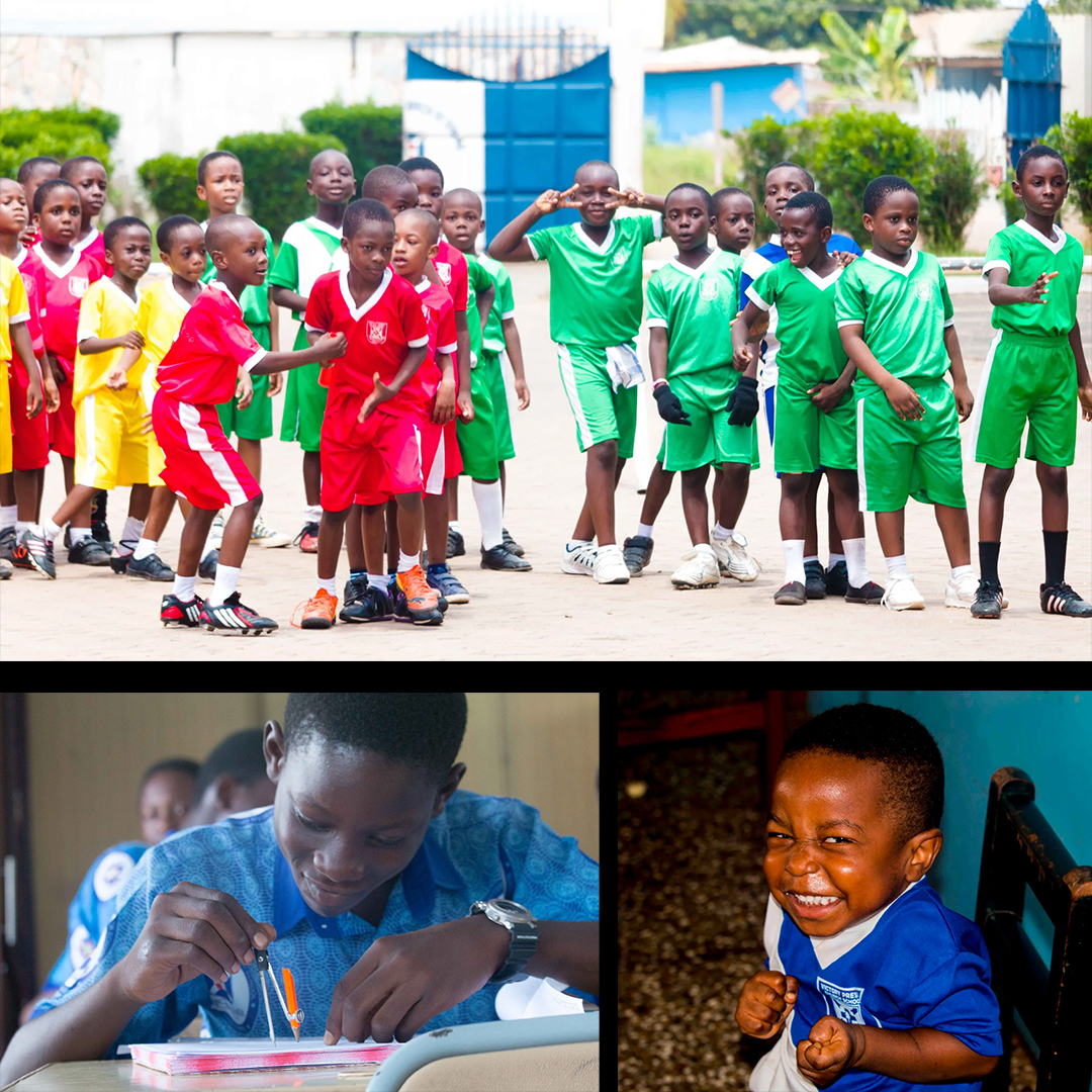
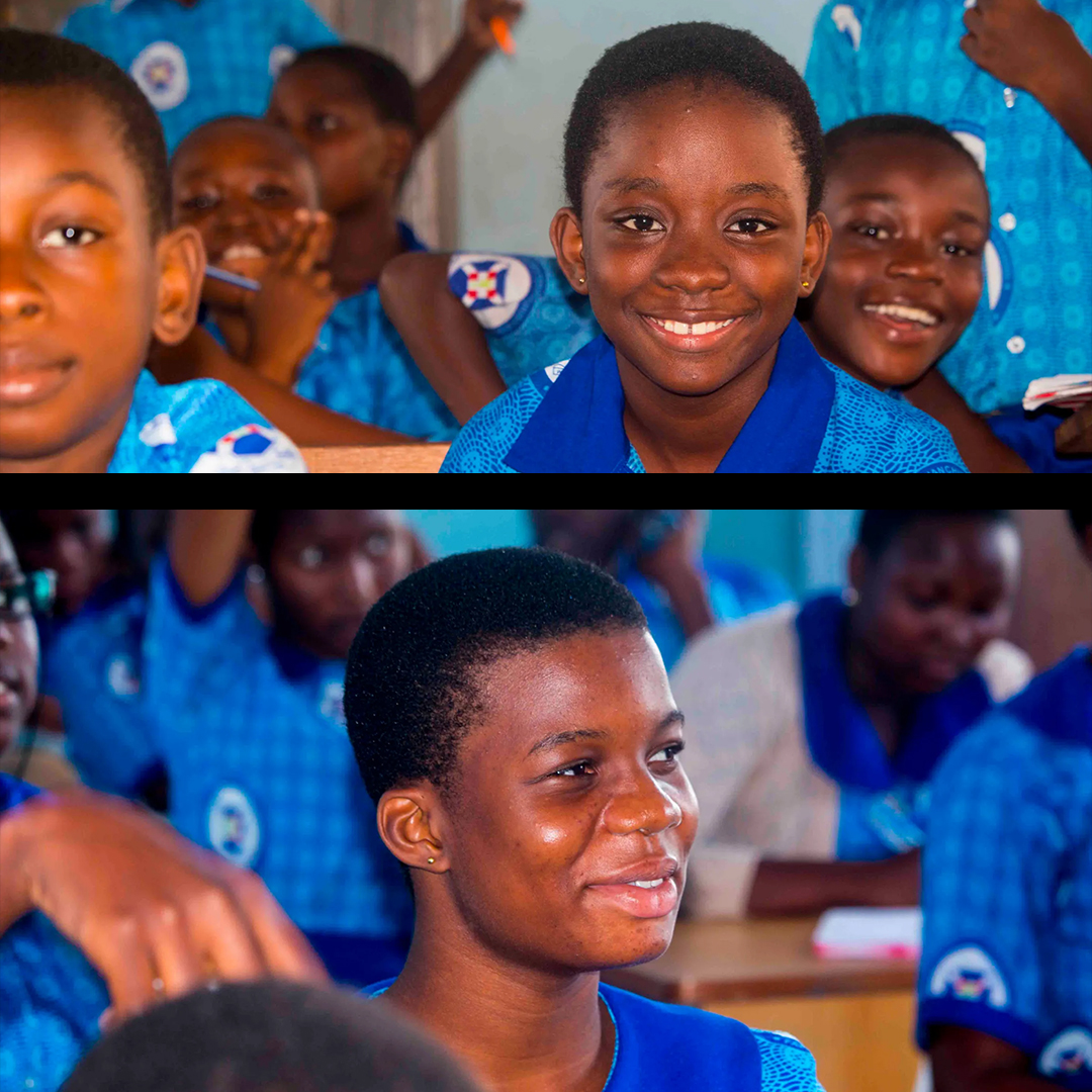
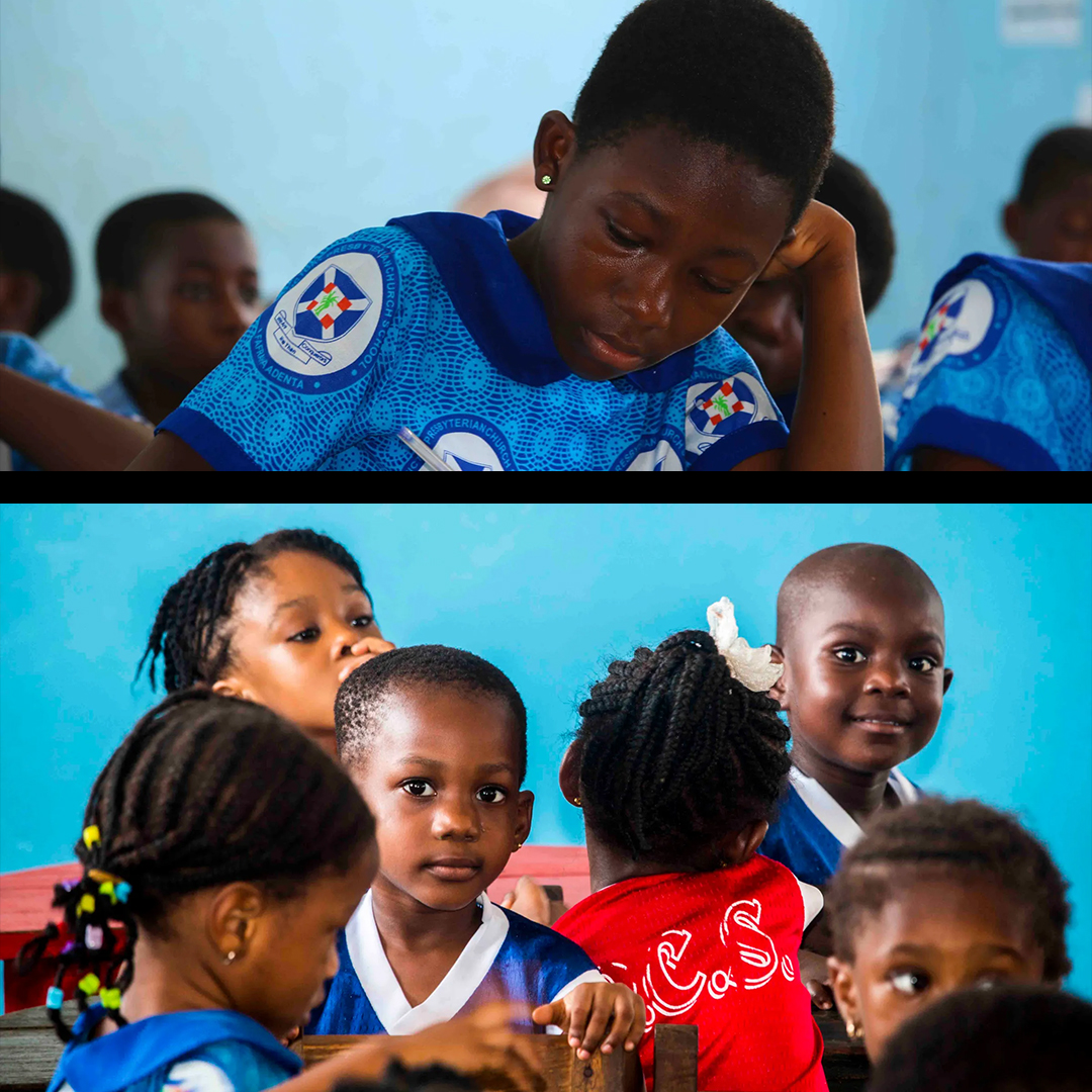
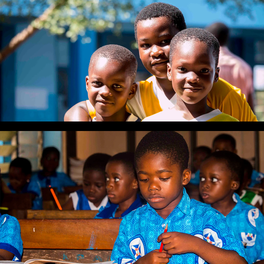
"A photograph doesn't just capture a moment — it tells the truth of a story."
Great photography is the soul of authentic communication. My documentary and editorial photography work focuses on capturing real human moments — the kind that make audiences lean in, feel something, and connect deeply with the story being told.
My photography portfolio features a compelling body of work centered on children in educational and community environments. Shot in vivid, natural light, these images portray the joy, curiosity, focus, and resilience of young learners — making them ideal for NGO campaigns, education sector communications, community development reports, and social impact storytelling.
The collection showcases a range of photographic skills — wide environmental shots that capture scale and community, intimate portrait-style close-ups that reveal emotion and character, and candid action shots that document life as it happens.
These images have the kind of warmth and authenticity that stock photography simply cannot replicate — because they are real, they resonate.
What I deliver: Documentary photography, editorial portraits, event coverage, community and social impact photography, and campaign imagery for NGOs, foundations, schools, and purpose-driven brands.
Video Production
"Junction AD"
The video is a short, energetic promo that introduces a brand or show called "The Junction." It uses bold red and orange visuals, quick cuts, and layered graphics to grab attention. Throughout the clip, large text and image collages highlight different content themes like entertainment, controversy, and comedy, suggesting a mix of lively, personality-driven discussions. The repeated phrase "Let's meet at the Junction" reinforces the central idea of a shared space for engaging, trending conversations. Overall, it feels like an intro designed to establish identity and set the tone for a dynamic media platform.
"Quantum Shield"
The video presents a futuristic, high-intensity concept centered around "Quantum Shield," using sleek visuals, glowing effects, and rapid transitions to convey innovation and advanced technology. It builds a sense of protection, power, and cutting-edge capability, likely positioning the concept as a next-generation solution or system. The pacing, sound design, and layered graphics work together to create a dramatic, almost cinematic tone, emphasizing strength, security, and forward-thinking design. Overall, it feels like a promotional piece aimed at showcasing a bold, tech-driven idea with strong visual impact.
"Akua"
The video is a warm, character-driven narrative piece centered on a figure named Akua. Using authentic visuals and intentional storytelling, it brings a personal or brand story to life with emotional depth. The pacing allows each scene to breathe, creating a sense of intimacy and connection with the viewer. Whether used for a brand campaign or documentary short, the piece demonstrates the power of human-centered storytelling in video production.
"AMA Pack"
The video showcases a clean, modern promotional presentation for "AMA Pack," using smooth transitions, bold typography, and polished visuals to highlight the product's identity and value. It emphasizes professionalism and clarity, likely focusing on packaging, branding, or a bundled offering, with visuals that suggest quality and organization. The pacing is steady and intentional, allowing each element to stand out while reinforcing a cohesive brand message. Overall, it feels like a refined marketing piece designed to communicate credibility, functionality, and visual appeal.
Documentary
"Badiliko Documentary"
Step inside a story of access, opportunity, and transformation. This short documentary captures the energy of a learning environment where technology is opening new doors for students. In bright computer labs, young learners engage with digital tools that expand how they think, create, and connect, while scenes from across the campus reveal the rhythm of daily school life.
Through candid conversations with educators and program leaders, the film offers a closer look at the purpose behind the work — bridging gaps in access and equipping the next generation with skills for a rapidly evolving world. Grounded in real experiences and everyday moments, it highlights both the challenges and the meaningful impact of bringing digital education into underserved communities.
More than just a glimpse into a school, this is a story about possibility — where curiosity meets opportunity, and where small changes are shaping brighter futures.